Design comparison
SolutionDesign
Solution retrospective
All comments welcome.
Community feedback
- @Mostafa-TPosted over 3 years ago
Hey, 👋
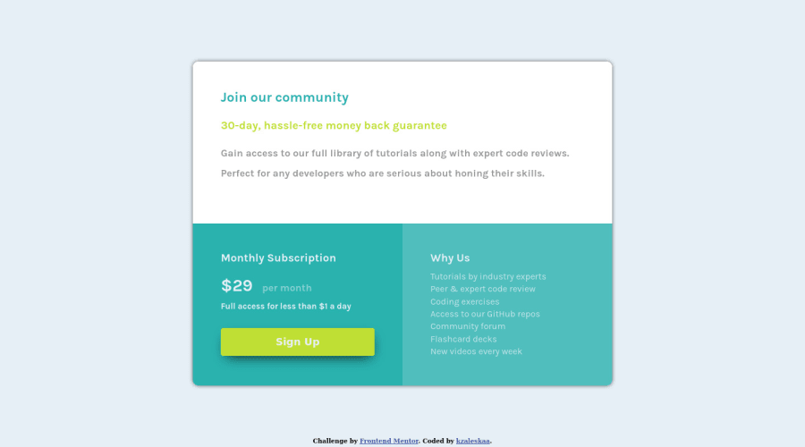
Your design is really good and responsive too, Keep rocking 🚀 there are some stuff I hope you consider when adjusting this project:- It will better if you adjust the size of the fonts.
- the paragraph in the original design is a bit lighter.
- the box shadow of the main container should have more radius and blur for example:
/* offset-x | offset-y | blur-radius | spread-radius | color */
box-shadow: 0px 0px 5px 3px rgba(0, 0, 0, 0.2);
Happy coding 👨🏽💻
Marked as helpful0
Please log in to post a comment
Log in with GitHubJoin our Discord community
Join thousands of Frontend Mentor community members taking the challenges, sharing resources, helping each other, and chatting about all things front-end!
Join our Discord
