Design comparison
SolutionDesign
Solution retrospective
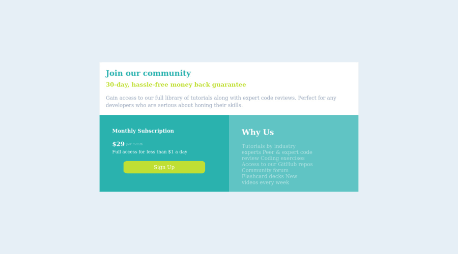
Idk but I think I got alot of wrong things done here and I cannot write media for the phone screens so anyone can help me do that
Community feedback
- @thekarthikrPosted almost 2 years ago
Hi Mathew, Your solution for this challenge comes really well But I recommend you try this with
display: gridinstead ofdisplay:flex. Also, you can make this responsive for mobile screen sizes using media queries.I hope it helps, Have a great time.
Marked as helpful0
Please log in to post a comment
Log in with GitHubJoin our Discord community
Join thousands of Frontend Mentor community members taking the challenges, sharing resources, helping each other, and chatting about all things front-end!
Join our Discord
