Not Found
Not Found
Not Found
Not Found
Not Found
Not Found
Not Found
Not Found
Not Found
Not Found
Not Found
Not Found
Not Found
Not Found
Not Found
Not Found
Not Found
Not Found
Not Found
Not Found

Submitted

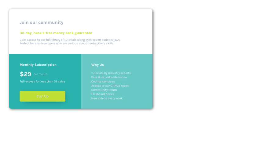
Price Card made with Flexbox and Responsive Design

Sebastian 60

@SebasAran16

Desktop design screenshot for the Single price grid component coding challenge

This is a solution for...

  • HTML
  • CSS
1newbie
View challenge

Design comparison


SolutionDesign

Solution retrospective


Is it ok that I did a tablet design?

Community feedback

@catherineisonline

Posted

Nice! 🙌🏻

I would also add some transitions for active states (when colors change on hover). It creates more interactivity and makes the project looks cooler. Active states can be done on buttons, links, titles which act like links or anything else, you choose.

You can read more about it here, in case you haven’t done much of it:
https://www.w3schools.com/css/css3_transitions.asp

IF THIS WAS HELPFUL PLEASE MARK IT AS HELPFUL 🤩

Marked as helpful

1

Sebastian 60

@SebasAran16

Posted

@catherineisonline Omggg! Did not know about transitions, added them to the font-size and it look way better now. Personally I love feedback, did not expect this from this site and I am loving it!

0
Hassia Issah 50,670

@Hassiai

Posted

Replace <div class="card"> with the main tag to fix the accessibility issues.

To center a content on a page, add min-height:100vh; display: flex; align-items-center: justify-content: center; to the body. There is no need to give .card a height value.

There is no need to give each section a height instead give each section a padding value.

in the media query , give .card a with of 80% .

Use rem or em as unit for the padding , margin, width and preferably rem for the font-size for more on this watch this https://youtu.be/N5wpD9Ov_To

Hope am helpful HAPPY CODING

Marked as helpful

1

Sebastian 60

@SebasAran16

Posted

@Hassiai Hey! Thank you very much, this is much more professional right now. As I was coding I feared that I was being redundant by the unexperience I have, this is just really helpful!

Personally I think the 100% looks more accurate than the 80% due the given image, changed all other things you told me but did not get the <div class="card"> accesibility issues, I'd love to get further explanation about it.

Thank you very much again!

0

Please log in to post a comment

Log in with GitHub
Discord logo

Join our Discord community

Join thousands of Frontend Mentor community members taking the challenges, sharing resources, helping each other, and chatting about all things front-end!

Join our Discord