Design comparison
SolutionDesign
Solution retrospective
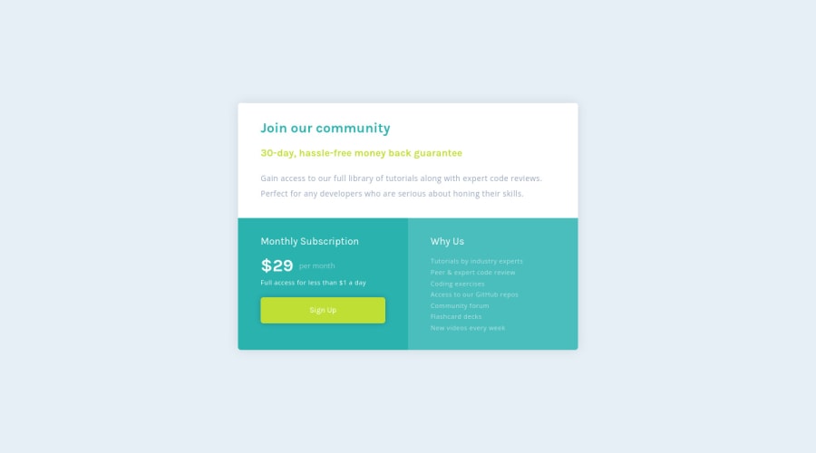
Loved the color scheme for this one!
Community feedback
- @seangray-devPosted about 2 years ago
Hey Rachel,
I like the solution to your design! The only thing I would suggest is to make the "Sign-Up" button more obvious that it's clickable and that its an interactive element by adding pseudo element selectors when hovering or focused on it. The button should also redirect users somewhere so we could use a
<a class= "btn-sign-up" href="#">Sign-Up</a>instead by also giving it a class for us to select it. Here is some code you could also add:.btn-sign-up { cursor: pointer; transition: all .3s ease; } .btn-sign-up:hover, .btn-sign-up:focus { background-color: white; color: hsl(71deg, 73%, 54%); } Hope this helps! Keep it up 😁0
Please log in to post a comment
Log in with GitHubJoin our Discord community
Join thousands of Frontend Mentor community members taking the challenges, sharing resources, helping each other, and chatting about all things front-end!
Join our Discord
