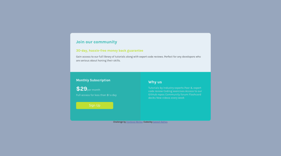
Design comparison
Solution retrospective
That's great everything is great I am take this challange to sharpen and test my grid and i found that i am null now very little I think I know about grid .
- why the 1fr unite not working on large screen (the bottom right corner was not fill automatically on 1500px and more big screen)
- when my font size was fixed the text was overflow is there any property to fix that i do it with @ querry .
- I am trying to make responsive page by less Media querry did you give me feedback on my code and for learning right code
Feel free to give me feedback I appriciate your feedback
Community feedback
- @NaveenGumastePosted over 2 years ago
Hello Ganesh ! Congo 👏 on completing this challenge
Let's look at some of your issues, shall we:
-
the background color is given in style-guide.md
-
Why us section color is too much light and i know it was not given in style-guide so use color-zilla chrome extension. and you will get the color
-
This is color i used for my solution
--light-cyan: hsl(179, 45%, 52%);check my solution here if needed
happy Coding😀
Marked as helpful1 -
- @dwhensonPosted over 2 years ago
Hi, @Ganesh-Rathor - nice try.
Your first issue is becuase you are using
auto-fitfor the columns. As a result the browser tries to fit in as many columns as it can according to the parameters provided.Try changing the
1frto 50% and see if you can see why that might work? This means that each column will not go smaller than 250px, so it will be forced to wrap, and not bigger than 50%.Hope this helps.
Cheers Dave
Marked as helpful0
Please log in to post a comment
Log in with GitHubJoin our Discord community
Join thousands of Frontend Mentor community members taking the challenges, sharing resources, helping each other, and chatting about all things front-end!
Join our Discord
