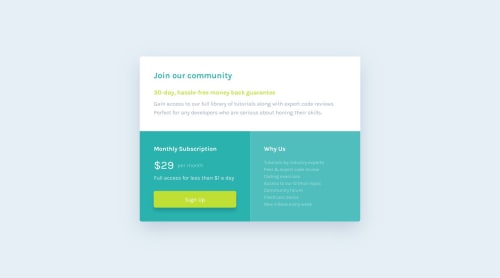
Single price grid component by HTML and CSS (Sass)

Solution retrospective
I am most proud of creating a responsive layout using CSS Grid and Flexbox, as it helped me structure the design effectively for both mobile and desktop views. Additionally, leveraging SCSS allowed me to write clean and maintainable code, which I found very rewarding. Next time, I would focus on:
- Improving accessibility by adding more comprehensive ARIA roles.
- Optimizing performance through better asset management and smaller CSS files.
- Exploring JavaScript interactivity to make the design more dynamic and engaging.
The main challenge was creating a fully responsive layout, which I solved using CSS Grid and Flexbox for flexibility. Maintaining consistent styles was another hurdle, overcome by leveraging SCSS variables and mixins. Debugging layout issues with Chrome DevTools also played a key role in resolving problems efficiently.
What specific areas of your project would you like help with?I would like help with further optimizing the responsiveness of the layout for more screen sizes and refining accessibility features, such as improving ARIA roles and ensuring compatibility with assistive technologies. Additionally, I’d appreciate guidance on enhancing performance through better CSS optimization and exploring ways to add more interactivity with JavaScript.
Please log in to post a comment
Log in with GitHubCommunity feedback
No feedback yet. Be the first to give feedback on Kairung Vangmanaw's solution.
Join our Discord community
Join thousands of Frontend Mentor community members taking the challenges, sharing resources, helping each other, and chatting about all things front-end!
Join our Discord