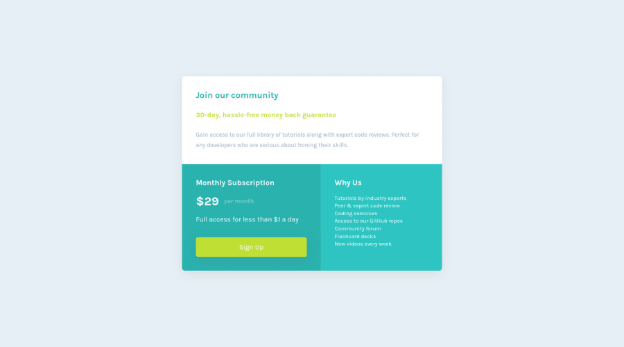
Design comparison
SolutionDesign
Solution retrospective
Any tips or good practices for CSS grid would be splendid! Any feedback/advice is also welcome.
Community feedback
- @vanzasetiaPosted almost 2 years ago
Hi, Ralph!
Here are some suggestions for improvements.
- Don’t skip heading levels. Or in other words, heading levels must always be in order to give structure to a page. Learn more — How-to: Accessible heading structure - The A11Y Project
- "30-day, hassle-free money back guarantee" is not a heading. It is a paragraph element. You can wrap the text with
<strong>tag. <button>element must always havetypeattribute to prevent unexpected behavior. Source: Checklist - The A11Y Project #use-the-button-element-for-buttons- There should not be text in
<span>and<div>alone. Wrap the text with a meaningful element like a paragraph element. - Prefer unitless numbers for line-height values to avoid unexpected results. Learn more — line-height - CSS: Cascading Style Sheets | MDN
I hope this helps. Happy coding!
Marked as helpful0 - @HassiaiPosted almost 2 years ago
To center the main on the page, add min-height:100vh; display: flex; align-items: center: justify-content: center; or min-height:100vh; display: grid place-items: center to the body. instead of giving it a margin value.
Replace <section class="join-our-community"> with the main tag, <h3> with <h2> to fix the accessibility issues.
Hope am helpful. HAPPY CODING
0
Please log in to post a comment
Log in with GitHubJoin our Discord community
Join thousands of Frontend Mentor community members taking the challenges, sharing resources, helping each other, and chatting about all things front-end!
Join our Discord
