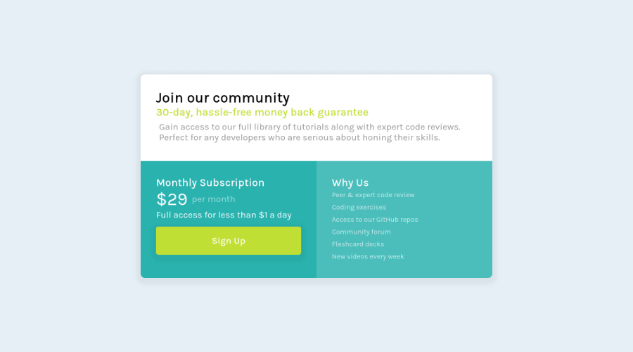
Design comparison
SolutionDesign
Community feedback
- @VCaramesPosted almost 2 years ago
Hey there! 👋 Here are some suggestions to help improve your code:
- The
sectionelement is being used incorrectly ❌ and not needed for this challenge .
- The “30-day, hassle-free money back guarantee” is not a heading❌. It should instead be wrapped in a
paragraphelement.
- The button was created with the incorrect element ❌. When users click on the button they should directed to a different part of your site; the
anchorelement will allow this to happen.
More Info:📚
- This is a great challenge to practice using
CSS Grid⚠️ If you are not comfortable using it, here is a link that is all about how to use CSS Grid:
https://css-tricks.com/snippets/css/complete-guide-grid/
- Implement a "Mobile First" approach 📱 > 🖥
Mobile devices are now the dominant 👑 way in which people browse the web, it is critical that your website/content looks perfect on all mobile devices.
More Info: 📚
If you have any questions or need further clarification, feel free to reach out to me.
Happy Coding! 🎆🎊🪅
Marked as helpful0 - The
Please log in to post a comment
Log in with GitHubJoin our Discord community
Join thousands of Frontend Mentor community members taking the challenges, sharing resources, helping each other, and chatting about all things front-end!
Join our Discord
