

Design comparison

Solution retrospective
What do you think about this solution ? What could be enhanced ?
Please log in to post a comment
Log in with GitHubCommunity feedback
- @Bayoumi-dev
Hey Pedro, Congratulations on completing this challenge... You have
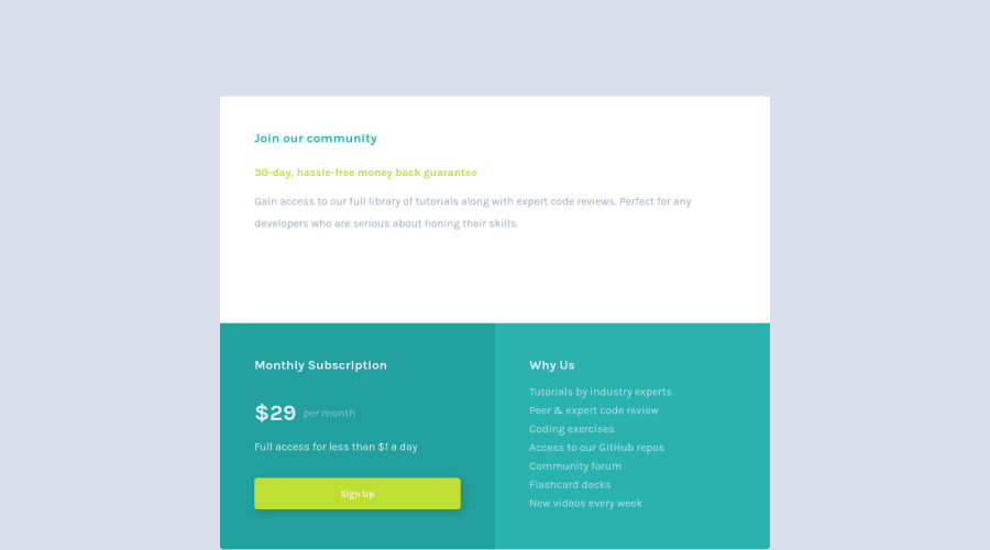
accessibility issuesthat need to fix.Document should have one main landmark, Contain the component with<main>.
<main> <div class="grid"> //... </div > </main>-
Heading levels should only increase by one, Useh2instead ofh3...Ordered headingsmake it easier to navigate and understand when using assistive technologies. -
I suggest you put the
Why Uscontent into thelist itemto add moresemanticsto your project.
<ul class="why-us-list">
   <li>Tutorials by industry experts</li>
   <li>Peer & expert code review</li>
   <li>Coding exercises</li>
   <li>Access to our GitHub repos</li>
   <li>Community forum</li>
   <li>Flashcard decks</li>
   <li>New videos every week</li>
</ul>
I hope this is helpful to you... Keep coding👍
- @Samadeen
Hey!! Cheers 🥂 on completing this challenge.. .
Lets firstly work on your accessibility issues.
Document should have on main landmarkbasically means your html should be structured more semantically and the correct format should be your<header>......</header>followed by your<main>......</main>and lastly your<footer>....</footer>hence you should use<main class="grid">instead of<div class="grid">.- You should also go down orderly when you are using the headings h1 down to h2 down to h3 and so on.
This should fix most of your accessibility issues.
. Regardless you did amazing... hope you find this helpful... Happy coding!!!


Join our Discord community
Join thousands of Frontend Mentor community members taking the challenges, sharing resources, helping each other, and chatting about all things front-end!
Join our Discord