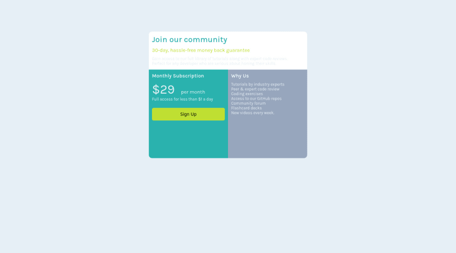
Design comparison
Solution retrospective
First try using CSS grid in a project, was there a better way for me to write my code? Let me know down below. Please ;(, low-key i'm struggling :D
Community feedback
- @myrojoyleePosted almost 2 years ago
Hi! I am still learning also! I think you can probably wrap the top-part, bottom-left, and bottom-right sections in one div, named "card", and then define your border-radius in one section instead of have 3 separate areas defining separate sections with the same border-radius property.
Then that one line can look like this:
.card{ overflow: hidden; border-radius: 10px; }
You can add overflow:hidden; inside the .body part as well and that should give all your corners the curve :D.
Similarly, I defined the body font in the body area as 'white', and then just changed everything else in the sections below. That can cut some of the lines like these:
.right { color: white; }
.bottom-left>p { color: white; }
I did not see any changes when I commented those parts out so probably works with less lines.
I hope this helps somewhat. If what I said was confusing, I can send all the things I played around with using your code so you can see what I modified. Feel free to reach out ^_^
0@YouLackHopePosted almost 2 years ago@myrojoylee Thank You Joy :), Does this count as reaching out?
0 - @HassiaiPosted almost 2 years ago
Replace <div class="container"> with the main tag to fix the accessibilty issue.
To center .container on the page using flex-box, add min-height:100vh; to the body and remove the margin value.
There is no need to give . container a height value, give .container an increased width value and a grid-template column of 1fr 1fr. Give .top a grid-column: 1 / 3; sample and all the griditems the same padding value for all the sides
.container{ width: 600px; grid-template-columns: 1fr 1fr; } .top{ padding: 40px; repeat the padding value for .bottom-left and .bottom-right grid: column: 1 / 3; }
You forgot to add a media query for the mobile design, in the media query give .containe a max-width value and grid-template-columns of 1fr.
Use rem or em as unit for the padding, margin, width and preferably rem for the font-size for more on CSS units.click here
Hope am helpful.
Well done for completing this challenge. HAPPY CODING
0
Please log in to post a comment
Log in with GitHubJoin our Discord community
Join thousands of Frontend Mentor community members taking the challenges, sharing resources, helping each other, and chatting about all things front-end!
Join our Discord