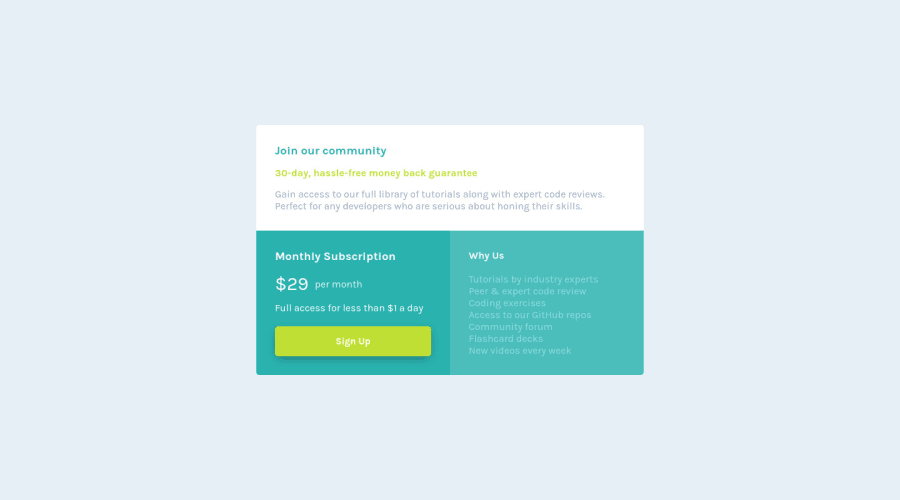
Design comparison
Solution retrospective
Any feedback will be appreciated!
Community feedback
- @kxnzxPosted over 2 years ago
Hello @ESteban-07,
You did a great job! The design looks similar, well done!
I have some suggestions...
It is important to use semantic HTML. "A semantic element clearly describes its meaning to both the browser and the developer." It is good to use div’s for the purpose of styling and arranging components on the page. Div’s are like empty containers, but they do not have any semantic meaning.
-
Instead of <div class="grid-container"></div> use <main class="grid-container"></main> tag. The main tag is considered an accessibility landmark and ensures that a screen reader and people with visual impairment have the ability to jump and identify sections of the page. Examples of landmarks are: header, nav, main, aside, section, footer.
-
You always need just ONE h1 in your page. This is very important for search engines, screen readers, SEO and people with visual visual impairment to know what your page is about. Wrap “Join our community” into an <h1></h1> tag. Then (when needed) you follow it up with subheadings such as an h2, h3, h4 etc. It’s the hierarchy that matters. (Don't look at the font-size.) Just ask yourself the question "What is the most important title on the page?". Then just remember that the most important title on the page is always an h1. You can wrap “30-day, hassle-free money back guarantee” in an <h2></h2> tag, because it's a subheading of the h1. I would wrap "Monthly Subscription" and "Why Us" also in an <h2></h2> tag. They are both subheadings of the <h1></h1> (the most important title on the page).
0 -
Please log in to post a comment
Log in with GitHubJoin our Discord community
Join thousands of Frontend Mentor community members taking the challenges, sharing resources, helping each other, and chatting about all things front-end!
Join our Discord
