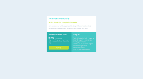
Design comparison
Solution retrospective
should i set the height for the whole card or i can set the height for each and every small card while in mobile format
Community feedback
- @Deevyn9Posted about 2 years ago
Hi Brian, there's and issue with the github pages and the site isn't loading.
Marked as helpful1 - @vabel17Posted about 2 years ago
I'd say avoid setting height on elements that not necessarily need it. Let your content shape its container.
Marked as helpful1 - @rafdidactPosted about 2 years ago
Hey, Brian! I got a few suggestions that would make your solution even better.
-
You should add a
padding
to each one of the sections inside of your card. In my solution for this challenge, I gave each section apadding
of2rem
for the mobile version, and4rem
for the desktop version. You can check the code visiting my repository. -
Your card component and your button should have a
box-shadow
property matching the shadow effect they have in the design. Again, you can check my repository for reference.
Feel free to reach out if you need help!
Marked as helpful0 -
Please log in to post a comment
Log in with GitHubJoin our Discord community
Join thousands of Frontend Mentor community members taking the challenges, sharing resources, helping each other, and chatting about all things front-end!
Join our Discord