Design comparison
Community feedback
- @Kamasah-DicksonPosted about 3 years ago
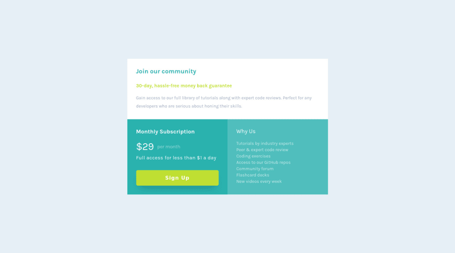
Your solution looks great and your texts are also readable on smaller devices. Remember to add a small amount of box shadow to your solution. Good job there👍 Happy coding👍
0 - @shashreesamuelPosted about 3 years ago
Excellent work Mariem
Keep up the good work
Your solution looks great however I have some feedback on the design aspect.
-
I think that the font-weight of the currency is supposed to be a bit heavier as seen in the design
-
The card is missing a subtle box-shadow using
box-shadow. -
The signup button needs some margin from the bottom using
margin-bottomlikewise the description in the "Why Us" section. -
The card needs a border-radius using
border-radius.
Make sure that you generate a new screenshot since you have uploaded the code for your solution. You can do this by clicking the "Generate Screenshot" button that should be located below the screenshot of your solution.
I hope this helps
Cheers
0 -
Please log in to post a comment
Log in with GitHubJoin our Discord community
Join thousands of Frontend Mentor community members taking the challenges, sharing resources, helping each other, and chatting about all things front-end!
Join our Discord
