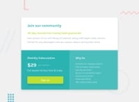
Design comparison
SolutionDesign
Community feedback
- @VCaramesPosted almost 2 years ago
Hey there! 👋 Here are some suggestions to help improve your code:
- The
sectionelement is being used incorrectly ⚠️ and not needed for this challenge .
- The button was created with the incorrect element ❌. When users click on the button they should directed to a different part of your site; the
anchorelement will allow this to happen.
More Info:📚
- The “Why Us” list needs to be created using an
unordered list ⚠️element along with thelist itemelement.
- Change ⚠️ the
heighttomin-heightin yourbodyelement, to improve your component's responsiveness.
- Change ⚠️
widthtomax-widthin your component’s container to make it responsive.
If you have any questions or need further clarification, feel free to reach out to me.
Happy Coding! 🎆🎊🪅
Marked as helpful0 - The
- @smavilpPosted almost 2 years ago
Hello, thank you for taking the time to comment on my solutions again. I am still learning from your recommendations. Could you please explain to me why the use of the section tag is incorrect?
0
Please log in to post a comment
Log in with GitHubJoin our Discord community
Join thousands of Frontend Mentor community members taking the challenges, sharing resources, helping each other, and chatting about all things front-end!
Join our Discord

