


@VenusY
Posted
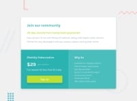
You've done an awesome job with this challenge! Well done on making the page look like the design.
I noticed that you hard-coded the width for the .container element at smaller screen sizes:
.container {
  width: 19.4375rem;
}
This causes some overflow issues on screen sizes where the viewport width is smaller than the width of the .container element.
It's generally not recommended to hard code a width as it isn't responsive to changes in viewport width.
If you want the width of this element to be limited to a certain value, you can do this instead:
.container {
  max-width: 19.4375rem;
}

@media (min-width: 39.6875em) {
  .container {
    max-width: 39.6875em;
  }
}
This will allow the element to shrink as much as its contents allow it to, which is more responsive and therefore better for user experience.
The button does not react to being hovered over, which makes it difficult to tell that you're interacting with the button.
To fix this, you can change the button's background colour upon being focused on or hovered over:
.sign-up {
  cursor: pointer;
}

.sign-up:hover,
.sign-up:focus-visible {
  background-colour: #9ccc4c
  color: #eee;
}
cursor: pointer; changes the user's cursor to a pointer to make it clearer that you're hovering over a clickable object.
:hover is a pseudo-class which allows you to style the button when it's being hovered over, and focus-visible is a pseudo-class which allows you to style a button that's been focused on via keyboard navigation.
I've used these two pseudo-classes to darken the background colour and font colour of the button to make it more obvious that the button is being interacted with.
These changes are not only good for visual reasons, but also make your site more accessible and user-friendly.
This is a very minor thing, but you could also consider adding some whitespace on either side of the .container element by applying margin or padding to the body element.
Whitespace is good for visual balance, which improves user experience as well.
Hope this has been helpful! :)
