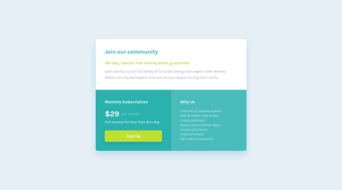
Submitted about 3 years agoA solution to the Single price grid component challenge
Single price grid component
accessibility, lighthouse
@andreasremdt

Solution retrospective
Hey there,
This is my solution to the single price grid component challenge. My goal was to make the markup as accessible as possible and the design as close to Figma as possible.
The HTML is enhanced by (schema.org)[https://schema.org/], marking the container as an offer with appropriate properties, such as name, price, and description.
Style-wise, the challenge was built desktop-first, introducing a single breakpoint to break the layout for better mobile support. Let me know what you think :)
Code
Loading...
Please log in to post a comment
Log in with GitHubCommunity feedback
No feedback yet. Be the first to give feedback on Andreas Remdt's solution.
Join our Discord community
Join thousands of Frontend Mentor community members taking the challenges, sharing resources, helping each other, and chatting about all things front-end!
Join our Discord