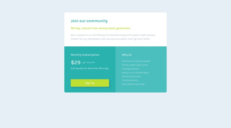


Design comparison

Solution retrospective
It felt good just to 'keep my hand in ' and reinforce the little I know so far. Not sure what I'd do differently next time - Grid perhaps ? - really don't know.
What challenges did you encounter, and how did you overcome them?I spent a lot of time mucking around with the padding and margins - managed to get what I think is a reasonable responsiveness but after way too much tweaking 😵💫.
What specific areas of your project would you like help with?I still need to understand how to set up more global configurations for margins and padding so I'm not continually adjusting individual elements for responsiveness . Any thoughts or links would be more than welcome.
Community feedback
- @LanceOSPosted 8 months ago
Good work.
When looking at your code I highly recommend looking into indentation. With how your code is now it can make the structure very difficult to read and work with.
When writing html you want to have a clean semantic structure. In your code it seems like you use a lot of divs where html elements should be used. So for your main container that contains your sections you want to use the <main> element, for some of the texts you have wrapped in divs you want to use the <p> element. Divs do not have semantic value and will not give context to the content inside.
For responsiveness it seems like you tried to create space between items using attributes such as padding and margin. An easier way to do this (at least what I do) would to give each container a
display: flex;and then set the gap between each of them. So instead of having to manual set the gap between items using margin/padding. Using gap will allow items to maintain an even gap between them even with smaller screens.Keep up the good work.
Marked as helpful0@hmac100Posted 8 months ago@IzykGit Hi there - thanks so much for the advice and the links - am definitely checking out. 👍
0

Please log in to post a comment
Log in with GitHub
Join our Discord community
Join thousands of Frontend Mentor community members taking the challenges, sharing resources, helping each other, and chatting about all things front-end!
Join our Discord