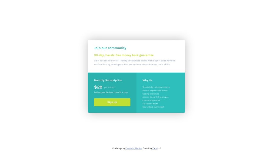
Design comparison
Community feedback
- @HassiaiPosted over 2 years ago
Replace <div id="card"> with the main tag,<h2> with <h1> and <h4> with<h2> to fix the accessibility issue. click here for more on web-accessibility .
for more on semantic html click here
To center #card on the page, add min-height:100vh; display: flex; align-items: center: justify-content: center; or min-height:100vh; display: grid place-items: center to the body.
Use rem or em as unit for the padding, margin, width and preferably rem for the font-size for more on CSS units. click here
Hope am helpful.
Well done for completing this challenge. HAPPY CODING
Marked as helpful1@cartaplassaPosted over 2 years ago@Hassiai huge thanks for your advice. I've made an update, now all properties use relative units and the font size and card dimensions are based on viewport height. Tested w/ desktop firefox and mobile chrome, seems to be working properly, although the card on the screenshot here is smaller for some reason.
0@HassiaiPosted over 2 years ago@zarni-ein, Hope you gave the body a background-color. the screenshot was based on a of 1440px screen size.
1@cartaplassaPosted over 2 years ago@Hassiai no, I didn't. And the color wasn't specified in design docs. I guess it's some grayish-blue offset of white, but I'm not sure how to pick it correctly.
0@HassiaiPosted over 2 years ago@zarni-ein if am not sure of the colors , I apply the colors to different element to see which color I have to use for the background and which color for other elements.
0
Please log in to post a comment
Log in with GitHubJoin our Discord community
Join thousands of Frontend Mentor community members taking the challenges, sharing resources, helping each other, and chatting about all things front-end!
Join our Discord
