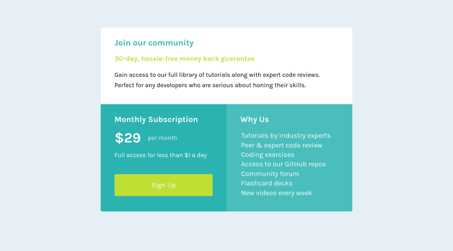
Design comparison
SolutionDesign
Community feedback
- @VCaramesPosted about 2 years ago
Hey there! 👋 Here are some suggestions to help improve your code:
- To center you content to your page, add the following to your Body Element:
body { min-height: 100vh; display: grid; place-content: center; }- To better specify the main content of you site you will want to encase your entire component inside a Main Element.
-
The “30-day, hassle-free money back guarantee” is not a heading. It should instead be wrapped in a Paragraph Element.
-
The button hover styling is incorrect. You want to look at the “style-guide and the “design files” to see how it should be.
If you have any questions or need further clarification, let me know.
Happy Coding! 👻🎃
Marked as helpful0@NTWayysPosted about 2 years ago@vcarames Thank you, have corrected the styling as well as the heading and centered the content in a main tag
0
Please log in to post a comment
Log in with GitHubJoin our Discord community
Join thousands of Frontend Mentor community members taking the challenges, sharing resources, helping each other, and chatting about all things front-end!
Join our Discord
