Design comparison
Solution retrospective
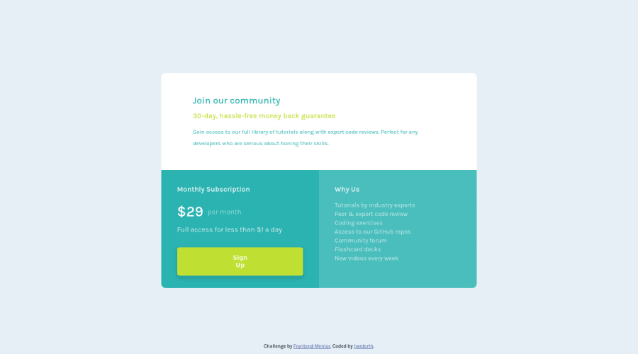
I still don't know how to center the div vertically [UPDATED]. But anyway everything seems good and responsive. I don't get why the "up" word of the "sign up" text into the button go to a new line when we use the zoom around less 1300px.
Community feedback
- @DavidMorgadePosted about 2 years ago
Hello Harderth, congrats on finishing the challenge!
If you want to center your
divvertically and horizontally at the same time, instead of using margins on yourdiv, try using flex-box in the parent element (the body), to archive this you have to set themin-heightof your body to100vh, with this it will take the full space of the screen, meaning that you can center the elements inside it with flexbox like this:body { font-family: 'Karla', sans-serif; font-size: 16px; background-color: hsl(204, 43%, 93%); display: flex; justify-content: center; align-items: center; flex-direction: column; min-height: 100vh; }I encourage you to try it in your solution and see if it works!
Hope my feedback helps you, if you have any questions don't hesitate to ask, goog job!
Marked as helpful1 - @imadvvPosted about 2 years ago
Greeting harderth!! Congratulations for completing Your challenge, 👏👏👏 well done.
you can center the div perfectly on middle of the page by using flex and body as a reference, first give the body
min-height: 100vh;to fill browser screen size, and apply flex portieres to it.-fix example.
body {

	min-height: 100vh;
	display: flex;
	flex-direction: column;
	align-items: center;
	justify-content: center;
}
Hope this help!
happy Codding, Have a Good Day/Night
Marked as helpful1@MrFougassePosted about 2 years agoThank you so much @DavidMorgade and @imadbg01 for your advices! What do you mean by "fix snippet" @imadbg01 ?
1@DavidMorgadePosted about 2 years ago@MrFougasse Hello man, the 'snippet' is the piece of code he posted, usually snippet are pieces of code that you need to use over and over in different projects, you usually config your code editor with shortcuts to write this snippets for you faster.
2@MrFougassePosted about 2 years ago@DavidMorgade Got it, yes I just modified the code, so now we should see the grid in the middle of the screen
1@imadvvPosted about 2 years ago@DavidMorgade Thank You David for clarifying I appreciate it, I was thinking of a fix example.
1 - @SindhujaBandaruPosted about 2 years ago
**Hello MrFougasse Congratulations on completing your new project 👏 ** I can't see the code for this site please share the link. And for the
buttonto center the whole text use👇display: flex;text-align:center;justify-content:center;align-items:center;max-width:100%;Happy Coding🥳🥳1@MrFougassePosted about 2 years ago@SindhujaBandaru I think here it is :
https://github.com/MrFougasse/challenges-frontend-mentor/blob/Single-price-grid-component/index.html
(I am very new to GitHub so I don't really get how it works)
0
Please log in to post a comment
Log in with GitHubJoin our Discord community
Join thousands of Frontend Mentor community members taking the challenges, sharing resources, helping each other, and chatting about all things front-end!
Join our Discord
