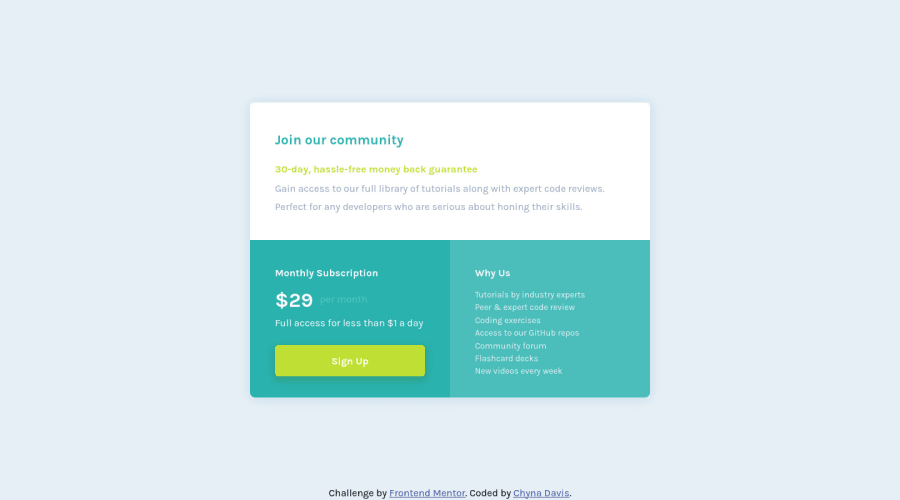
Single price grid component - made w/ flexbox + grid + utility classes
Design comparison
Solution retrospective
Are there ways to improve/simply my HTML and/or CSS code?
Community feedback
- @VCaramesPosted almost 2 years ago
Hey there! 👋 Here are some suggestions to help improve your code:
- The
section
element is being used incorrectly ⚠️ and not needed for this challenge .
- The button was created with the incorrect element ❌. When users click on the button they should directed to a different part of your site; the
anchor
element will allow this to happen.
More Info:📚
- For improved accessibility 📈 for your content, it is best practice to use
rem
for yourfont-size
and other property values. Whileem
is best formedia-queries
. Using these units gives users the ability to scale elements up and down, relative to a set value.
If you have any questions or need further clarification, feel free to reach out to me.
Happy Coding! 🎆🎊🪅
0@cmdavis21Posted almost 2 years ago@vcarames Should I just use rem for font size or use it for sizing all features including padding, widths, etc.? And the same question about using em but only for media queries.
0@cmdavis21Posted almost 2 years ago@vcarames Also, when is it appropriate to use/not use a button element vs. an anchor tag?
0 - The
- @vanzasetiaPosted almost 2 years ago
Hello, Chyna! 👋
I have some suggestions to improve this solution.
- Make "Monthly Subscription" and "Why Us" as
<h2>
to give structure to the page. <button>
element must always havetype
attribute to prevent unexpected behavior. Source: Checklist - The A11Y Project #use-the-button-element-for-buttons- Prefer
<link>
tags than@import
to use the Google Fonts. It makes the font family arrives faster.
I hope you find this useful. 🙂
0@vanzasetiaPosted almost 2 years ago@cmdavis21 I took a look at the updated solution. Everything looks great! 👏
0 - Make "Monthly Subscription" and "Why Us" as
- @CodeWithAlaminPosted almost 2 years ago
Hi Chyna Davis👋 Great job on completing this challenge! 🥳
I noticed a few areas where your solution to the challenge could be improved, and wanted to share my suggestions with you.
In the CSS file, there are a lot of duplicated or unused styles that could be removed to make the code more concise and efficient. For example, instead of having multiple selectors like
.grid-item
,.grid-item-1
,.grid-item-2
, etc, you could use a single selector.grid-item
and use CSS to target specific items using their index or id.- It could be beneficial to add more comments in the CSS file to explain the purpose of different sections of the code. This would make it easier for others to understand the codebase and make changes as needed.
Overall, this is a very well done solution to the challenge. Great job!
Hope I'm Helpful! 👍
Keep up the good work! 😊❤️
0@cmdavis21Posted almost 2 years ago@CodePapa360 Thanks for the reply. I added some more CSS comments and simplified how I call elements; hopefully, it cleared some things up.
1
Please log in to post a comment
Log in with GitHubJoin our Discord community
Join thousands of Frontend Mentor community members taking the challenges, sharing resources, helping each other, and chatting about all things front-end!
Join our Discord