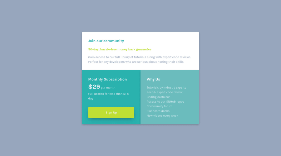
Design comparison
SolutionDesign
Solution retrospective
Centering this section was very challenging! I could not get it right for the longest time. I eventually used flex box and grid correctly to get the placement right. Other than that fiasco, this was a simple practice challenge.
Community feedback
Please log in to post a comment
Log in with GitHubJoin our Discord community
Join thousands of Frontend Mentor community members taking the challenges, sharing resources, helping each other, and chatting about all things front-end!
Join our Discord
