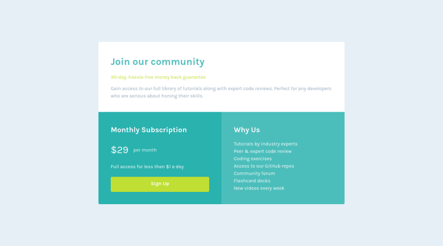
Design comparison
Solution retrospective
I struggled with the colors, I feel like i didn't get them right. I'm not ready to advance to the next level yet :(
Community feedback
- @VCaramesPosted almost 2 years ago
Hey there! 👋 Here are some suggestions to help improve your code:
- The
sectionelement is being used incorrectly ⚠️ and not needed for this challenge .
- The “30-day, hassle-free money back guarantee” is not a heading❌. It should instead be wrapped in a
paragraphelement.
- The button was created with the incorrect element ❌. When users click on the button they should directed to a different part of your site; the
anchorelement will allow this to happen.
More Info:📚
If you have any questions or need further clarification, feel free to reach out to me.
Happy Coding! 🎆🎊🪅
Marked as helpful1@SefalaThabisoPosted almost 2 years ago@vcarames Changes has been made, thank you for the help :)
1 - The
- @HassiaiPosted almost 2 years ago
Replace <h3> with <h1> to fix the accessibility issue.
Give the body the background-color you gave to box1 and give box1 a background-color of white use
#ffffor the color white.To center .boxes on the page using grid, replace the align-items with align-content: center and add min-height:100vh to the main. there is no need for a padding left and right value.
In the media query, increase the padding value of .box.
Hope am helpful.
Well done for completing this challenge. HAPPY CODING
Marked as helpful0@SefalaThabisoPosted almost 2 years ago@Hassiai Can i use h1 multiple times on a single page?
0@SefalaThabisoPosted almost 2 years ago@Hassiai I made the changes, thank you for the help
0
Please log in to post a comment
Log in with GitHubJoin our Discord community
Join thousands of Frontend Mentor community members taking the challenges, sharing resources, helping each other, and chatting about all things front-end!
Join our Discord
