

Design comparison
SolutionDesign

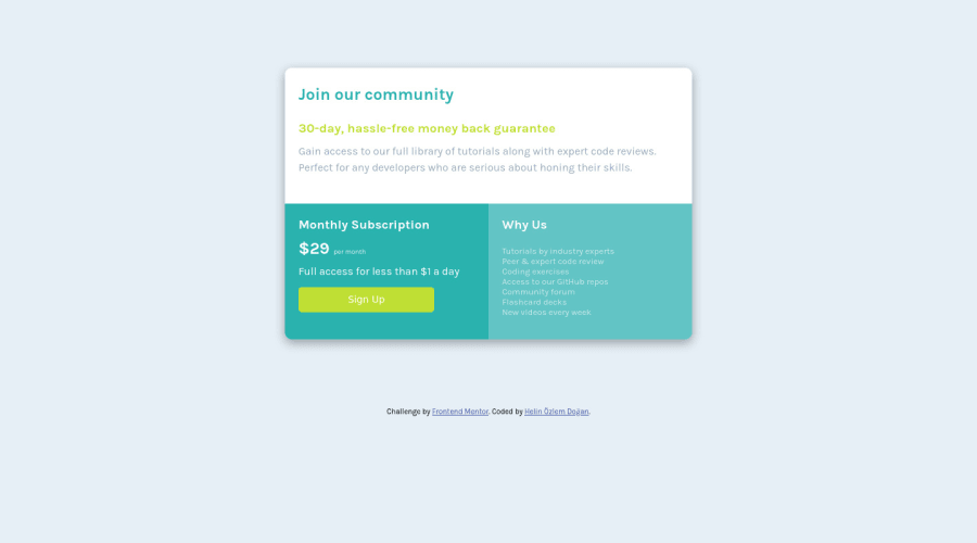
Solution retrospective
This is my first grid component challenge! I wanted to apply what I learned. I am open to any feedback!
Please log in to post a comment
Log in with GitHubCommunity feedback
- @fatihcandev
Looks good 👍🏼 I see that the body doesn't take up the height of the screen and the card doesn't look centered because of it. You might wanna fix that.
- @MikeBish13
Great job, Helin! Very neat implementation of grid and hopefully you can see how simple it makes creating layouts!
Couple of things to consider:
- I would consider adding a padding to the top and bottom of each of your sections, rather than adding it individually to each element - it'll save you a lot of time in the future and leaves you less prone to errors/it's easier to debug.
- Similarly, I would space out the individual elements within the containers using a margin top/bottom as opposed to padding. If the spacing between the elements is the same (eg 1.5rem), I would consider grouping these together in a single CSS declaration - again, it's less code and stops you repeating yourself.
Hope that helps!


Join our Discord community
Join thousands of Frontend Mentor community members taking the challenges, sharing resources, helping each other, and chatting about all things front-end!
Join our Discord