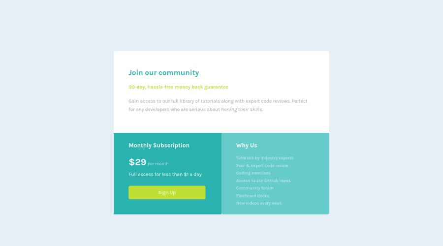
Design comparison
SolutionDesign
Solution retrospective
I had no real problems completing this challenge. It allowed me to review the so-called "combined selectors". Feel free to comment for improvements :) Thank you.
Community feedback
- @Finney06Posted over 1 year ago
Hello there ๐. Good job on completing the challenge !
Here are some suggestions regarding your code that may be of interest to you.
HTML ๐ท๏ธ:
To clear the Accessibility report:
- Always avoid skipping heading levels; Starting with
<h1>
and working your way down the heading levels (<h2>
,<h3>
, etc.) helps ensure that your document has a clear and consistent hierarchy. s.
I hope you find it helpful!๐ Above all, the solution you submitted is ๐. ๐Happy coding!
Marked as helpful0 - Always avoid skipping heading levels; Starting with
Please log in to post a comment
Log in with GitHubJoin our Discord community
Join thousands of Frontend Mentor community members taking the challenges, sharing resources, helping each other, and chatting about all things front-end!
Join our Discord