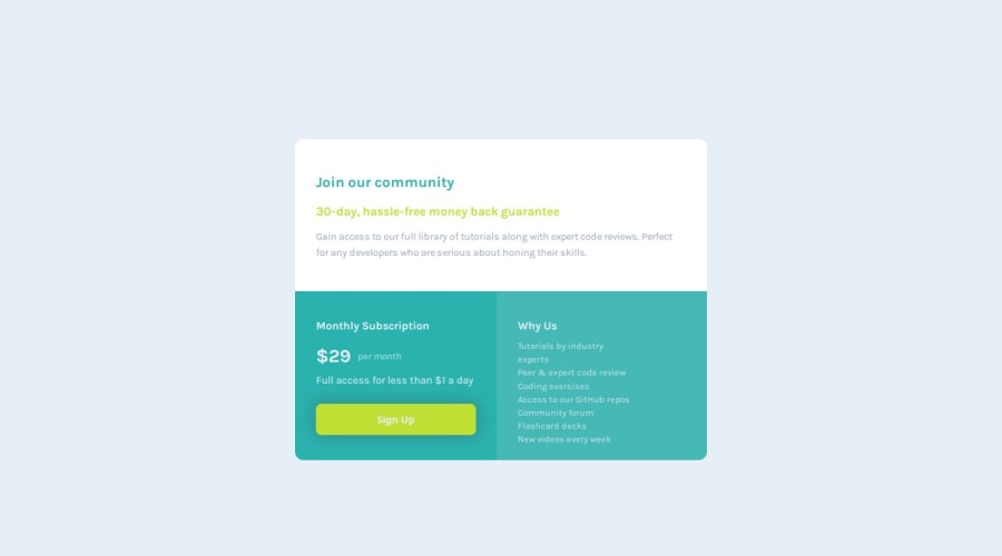


Design comparison

Solution retrospective
I'm proud of how quickly I completed this. My last project took too long so this was refreshing.
I also really enjoy using Grid, it makes things so easy.
I think I misused my classes in this one. I received some feedback to get into the habit of targeting classes, not elements, so that when I start working with more content, I'm not always making global changes all the time. I tried to implement this here, but in particular, I used a <section> element for the card, with no class, but when I went to apply a box shadow all the way around, it also included other <section> elements with classes. When I tried to replace the targeting with a class name instead, my design broke. I'd like to be able to use specificity to a better degree in future.
I had some challenges with sizing in the media queries. For instance, in the mobile design, I wanted the <li> in the <ul> to only take up one line, as visually, there is space. But <ul> has a margin-left that I was unable to remove, thereby making some <li> take up two lines.
That being said, I completed these media queries perhaps the fastest I ever have.
I had something happen that's occured for me before, where in Desktop, I make some corners have a border-radius, but in mobile, if the design becomes one column and I want to remove it, I'm unable. I haven't managed to figure this out.
I'd like help with using classes for specificity. My HTML contains many <section> tags, which might not have been the best use. I also created <article> tags, but didn't call on them in the CSS. I'm not sure why my design breaks when I replace the card tag of <section> with a class target. I'd like to understand this as I didn't foresee it and attempting to do the box-shadow around the outside was one of the last things I tried to do.
How do I get rid of the <ul> margin? margin/padding: 0; has no impact.
Why am I unable to remove border-radius in the mobile design? I don't know why my declarations have no impact when I attempt it.
Please log in to post a comment
Log in with GitHubCommunity feedback
- P@markuslewin
Hi!
I think the core problem here is all of the nesting. It results in selectors with very high specificity scores, which makes them difficult to override.
/* Specificity: (0,2,3) */
body main section .bottom .left {
  border-bottom-left-radius: 12px;
}

/* Specificity: (0,1,3) */
body main section .left {
  border-bottom-left-radius: 0px;
}
The border radius of
.leftwill still be12px, since the first rule has higher specificity. This is why you can't remove the margin of the list as well.
Most layouts are simpler on mobile. It's therefore generally better to start with the styles for mobile, and then override those styles inside media queries targeting tablet and desktop:
/* No nesting */
/* Mobile-first */
/* Simple class selector */
.left {
  border-bottom-left-radius: 0px;
}

/* `min-width` targeting tablet+ */
@media screen and (min-width: 720px) {
  /* Overrides mobile style */
  .left {
    border-bottom-left-radius: 12px;
  }
}

/* Desktop */
@media screen and (min-width: 1015px) {
}
In summary, code mobile-first, target classes, and don't nest rules. This'll solve a lot of your problems! 🙂
Marked as helpful

Join our Discord community
Join thousands of Frontend Mentor community members taking the challenges, sharing resources, helping each other, and chatting about all things front-end!
Join our Discord