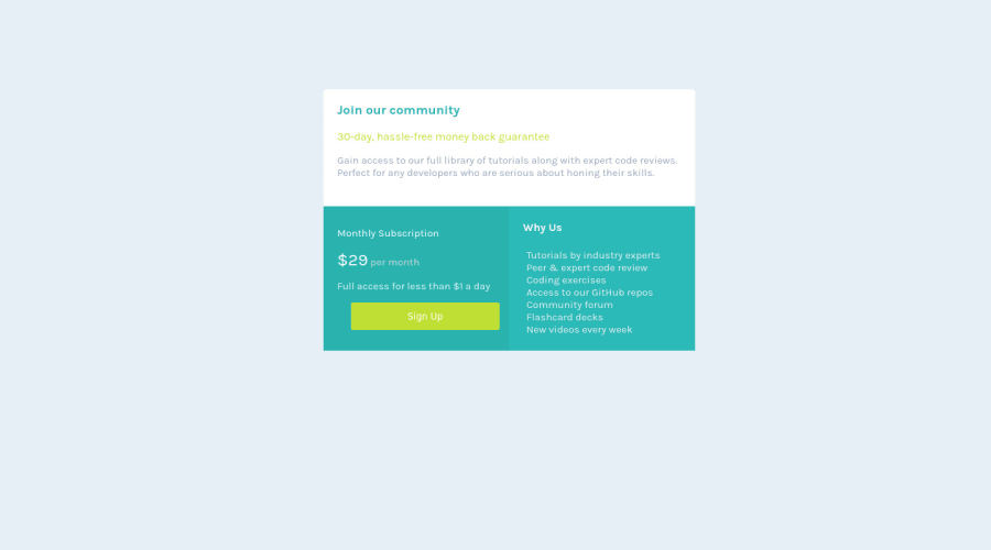
Not Found
Not Found
Not Found
Not Found
Not Found
Not Found
Not Found
Not Found
Not Found
Not Found
Not Found
Not Found
Not Found
Not Found
Not Found
Not Found
Not Found
Not Found
Not Found
Not Found

Submitted

Single Price Grid Component

@AdrielMurray

Desktop design screenshot for the Single price grid component coding challenge

This is a solution for...

  • HTML
  • CSS
1newbie
View challenge

Design comparison


SolutionDesign

Solution retrospective


All feedback would be helpful and I'm curious how I can stop the button from changing size for responsive web design.

Community feedback

Lucas 👾 104,420

@correlucas

Posted

👾Hi Adriel Murray, congrats on completing this challenge!

You’ve done really good work here putting everything together, I’ve some suggestions you can consider applying to your code to improve the html markup/semantic:

1.You made your html structure entirely with div blocks but these div doesn't any semantic meaning, for this reason is better you use a better html markup improving your code, for example for each card you use <article> instead of the <div>.

2.The approach you've used to center this card vertically is not the best way, because using margins you don't have much control over the component when it scales. My suggestion is that you do this alignment with flexbox using the body as a reference for the container.

The first thing you need to do is to remove the margins used to align it, then apply min-height: 100vh to make the body height size becomes 100% of the screen height, this way you make sure that whatever the situation the child element (the container) align the body with display: flex and align-items: center / justify-items: center.

REMOVE IT:

.whole-container {
    /* min-height: 100vh; */
    /* margin-top: 130px; */
}

USE THAT:

body {
    MIN-HEIGHT: 100VH;
    background-color: hsl(204, 43%, 93%);
    font-family: 'Karla', sans-serif;
    display: flex;
    align-items: center;
    justify-content: center;
    flex-direction: column;
}

✌️ I hope this helps you and happy coding!

Marked as helpful

0

T
Grace 29,310

@grace-snow

Posted

@correlucas each card should not be an article, divs are fine to use. The whole component could be an article but not the sections within it.

Articles are for encapsulated content that could be syndicated - lifted and shifted on their own to another page or even another website.

However this is all one piece of related content. The headings required in the challenge would give all the semantic structure needed (along with choosing the correct elements for other written content)

0

@VCarames

Posted

Congrats @AdrielMurray on completing this challenge!

To perfectly center you content to you page, add the following to your <body> element.

body {
  min-height: 100vh;
  display: grid;
  place-content: center;
}

Congrats again and happy coding!

Marked as helpful

0
T
Grace 29,310

@grace-snow

Posted

The html in this needs

  • consistent indentation / formatting to make it readable
  • heading levels in order. This design shows 3 headings. The first one should be a h1, and the other two are h2s
  • the button to be changed to an anchor tag. They have different distinct purposes. Clicking that call to action (CTA) would take someone to a new page. Navigation = anchor tag not button tag
  • the div structure changing so each part/section is a direct child of the grid. This is a grid challenge so should be done with css grid not flexbox. That needs a different structure in html

The css needs

  • again, correct indentation. Formatting is really important for readability
  • refactoring to center the component on the screen as already recommended
  • remove large margins to create the layout. That's not how you center things
  • use css grid not flexbox here
  • give each section the same padding on all sides.
  • you can set border radius on the whole component (the grid) and give it overflow hidden so it visually crops out the corners of the child grid items.
  • font size in rem, never ever in px
  • the button (once changed to an anchor tag and styled via a class) must not have width and height. Use padding instead so it can grow/shrink as needed depending on content and users font size
  • none of these sections should have explicit width or height. Very important!
  • instead have a max width on the component only. In a min width media query to target larger screens you can increase this max width
  • set the grid template you want when you change this to use css grid. Then you will not need any widths at all on grid children as the grid template will define the sizes of each grid area
  • a key principle is to work mobile first. That means style for mobile as the default styles, then use min width media queries to target the larger screens
0

Please log in to post a comment

Log in with GitHub
Discord logo

Join our Discord community

Join thousands of Frontend Mentor community members taking the challenges, sharing resources, helping each other, and chatting about all things front-end!

Join our Discord