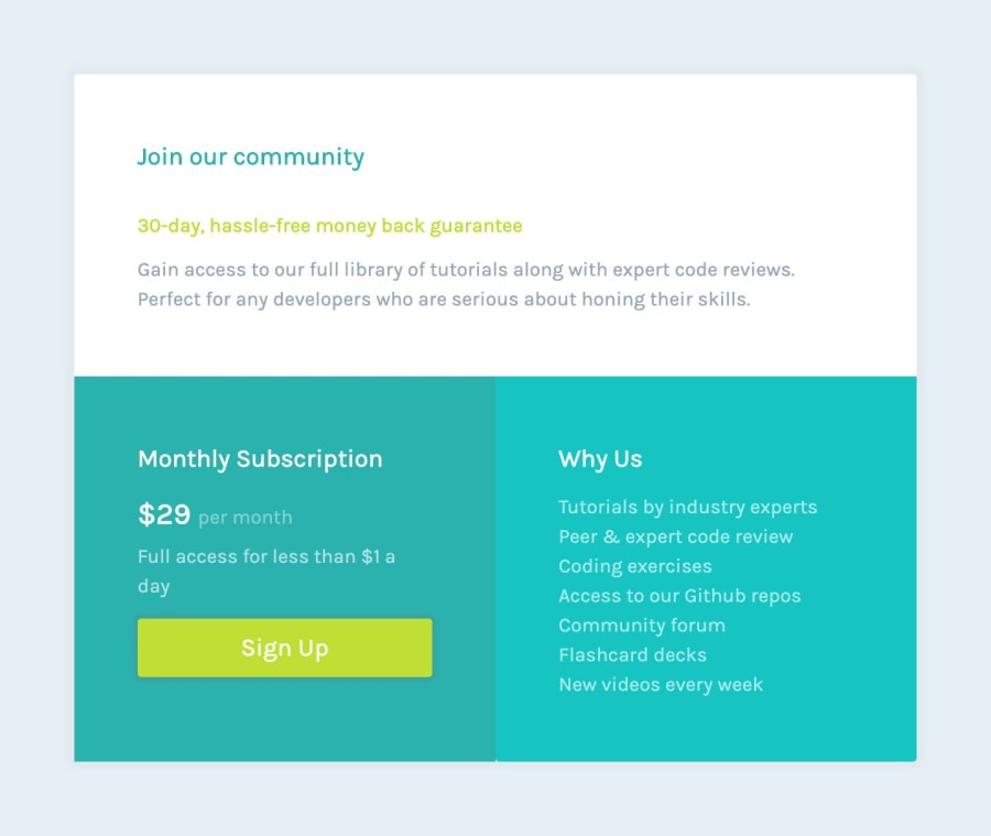
Design comparison
Please log in to post a comment
Log in with GitHubCommunity feedback
- @mattstuddert
Awesome job on this! 👍
Great to see you using Grid. Tiny little suggestion on the HTML would be to use a
ulfor the "Why Us" section instead ofptags. Also, I'd always recommend only ever using a singleh1on a page for accessibility reasons.Keep it up!
Join our Discord community
Join thousands of Frontend Mentor community members taking the challenges, sharing resources, helping each other, and chatting about all things front-end!
Join our Discord
