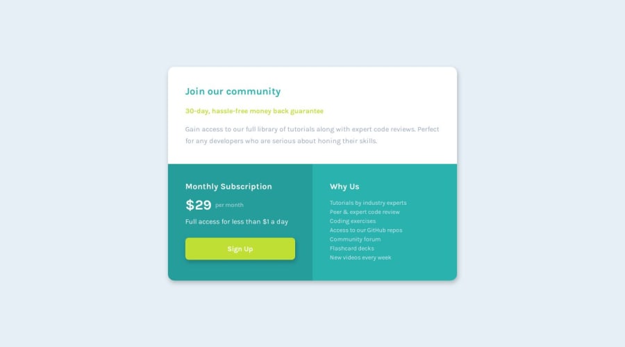
Design comparison
SolutionDesign
Solution retrospective
I struggled with a good way of centring the grid on the page without pushing the attribution off the end
Community feedback
- @bashirogluPosted over 4 years ago
Hi, Good job. What I will say is optional but if in the layout I won't use min-max, min-content, I would go with flexbox, both simple and better support. Good Luck.
0 - @Mahesh-yadavPosted over 4 years ago
Hi
You have set
grid-template-rows: 100vh;which is causing footer to be pushed below. Replace this line and your problem will be solved.0
Please log in to post a comment
Log in with GitHubJoin our Discord community
Join thousands of Frontend Mentor community members taking the challenges, sharing resources, helping each other, and chatting about all things front-end!
Join our Discord
