Design comparison
Solution retrospective
Any suggestions or critiques are highly appreciated!
Community feedback
- @pikapikamartPosted over 3 years ago
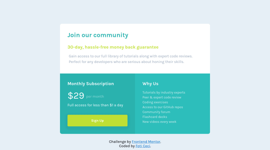
Hey, great work on this one. Layout is just quite big than the original. But hey, you still did good on the layout. Just that the attribution text is overlapping the content. The mobile layout seems good, maybe just a little bit of padding on the left and right.
Some suggestions would be:
- do not
position: absolutethe attribution, remove it. Then you can just addflex-direction: columnin yourbodytag. But applying this will make the layout not good, to fix, just simply remove thewidth: 800pxproperty on yourmainelement. You don't really need that one. Remove as well themargin: 0 autoon themainbecause thebodytag does the job centering it. Remove theoverflowas well. - for me, the "join our community" and "30-day, hassle-free money back guarantee" text could have been wrapped inside
h1tag with aspanthat wraps the second sentence and making it place in its own row. This is just preference though, haven't tackled this challenge yet. - again, for me, the "monthly subscription" along with the price below it could have been wrapped inside the
h2tag. The reason is that, when a screen reads that "monthly subscription" it will read as well the price, removing this blank space, if you know what I mean. Like "okay, so what is the price" something like that. - on the mobile state, remove the
position: absoluteagain on thefooterand instead, add amargin-topto it.
Other than those, really great job. Almost what I said is personal preference so no worries. Aside from the stylings.
Marked as helpful1@fotinh0Posted over 3 years ago@pikamart Thank you for your great feedback and explanation. I made the suggested changes. Highly appreciated!
0 - do not
- @rachanahegdePosted over 3 years ago
This looks really good and it's clearly responsive! Also nice work organising your code, it's readable and easy to navigate. Overall, great job.
Marked as helpful1
Please log in to post a comment
Log in with GitHubJoin our Discord community
Join thousands of Frontend Mentor community members taking the challenges, sharing resources, helping each other, and chatting about all things front-end!
Join our Discord
