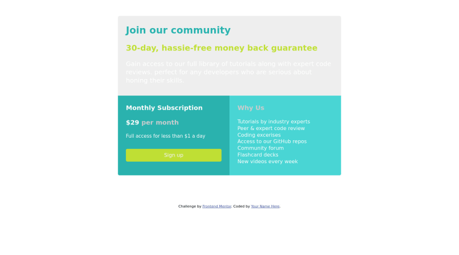
Design comparison
Solution retrospective
For this challenge, I'd love to learn more about how to adjust heading font-size and p font-size. The colors are also important as well. Any feedback about font-size and colors (background, text-colors) are welcome. Thanks!!
Community feedback
- @Nam-HaiPosted almost 4 years ago
Obviously, the header's background color is wrong, the color was in the style-guide.
-
For the two card at the bottom : All the texts had the same color, but for exemple you could play with the opacity for the "per month".
-
For the bottom-right card : You can use the css attribute "line-height" to set-up the spacing between lines of text. You won't have to break line by hand like you did.
-
You might want to have a mouseover effect on the button.
Marked as helpful0 -
Please log in to post a comment
Log in with GitHubJoin our Discord community
Join thousands of Frontend Mentor community members taking the challenges, sharing resources, helping each other, and chatting about all things front-end!
Join our Discord
