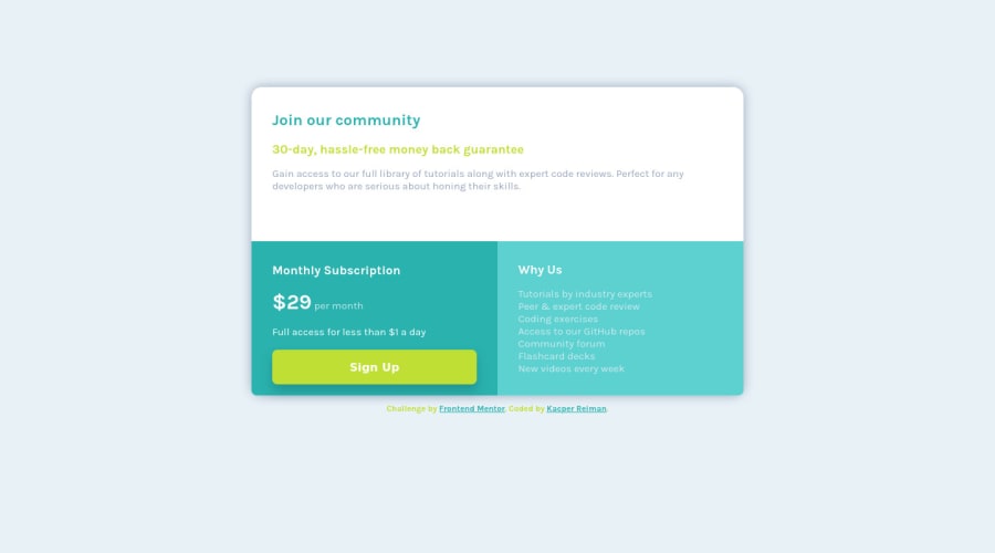
Design comparison
Solution retrospective
Any feedback would be apperciated
Community feedback
- @nenadmnePosted about 2 years ago
Nice solution there. I spent some spare time to look inside your code.
1.I think when switching from mobile to desktop version you should quit using % and give strict width and height. Its recomended for most sites to not get width over 800px so our eyes dont get tired moving around screen. My screen is so 1500+ so your solution was very much streched.
2.Instead writting
font-wight:700;ortransition: 0.5s;under every class, you could wrap them all under 1 place like thisbutton, .price span, .attribution { font-wight:700;}. When have same style for more then few classes, its always best to wrap them under 1 line so you change them easier and your code looks less stacked.Nice work and happy coding =)
Marked as helpful1
Please log in to post a comment
Log in with GitHubJoin our Discord community
Join thousands of Frontend Mentor community members taking the challenges, sharing resources, helping each other, and chatting about all things front-end!
Join our Discord
