Design comparison
SolutionDesign
Solution retrospective
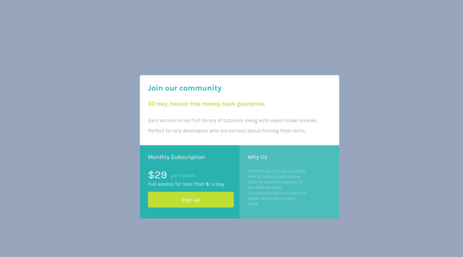
In this project I used grid as my display. I also used figma to help with font sizes and space for paddings. Some of the font sizes are small, but I did try to match them as close. I would recommend using something like figma to help with layout or go pro. It's difficult trying to guess sizes when you are new to coding. Overall this project was simple and fun.
Community feedback
Please log in to post a comment
Log in with GitHubJoin our Discord community
Join thousands of Frontend Mentor community members taking the challenges, sharing resources, helping each other, and chatting about all things front-end!
Join our Discord
