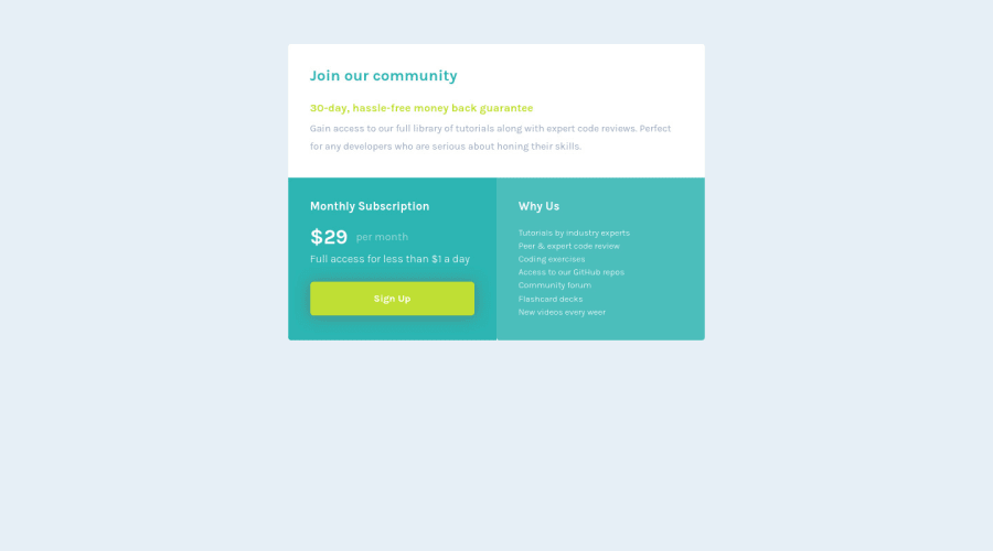
Design comparison
Solution retrospective
Hello everyone!
First and foremost, english isn't my first language so please forgive me for any mispellings or grammatical errors.
I'm an aspiring front-end developper and i'd like to ask some precisions about accessibility from more experienced devs. More precisely, what is the minimum 'level' of accessibility we, as developpers, are supposed to provide nowadays. I know that semantic markups and aria landmarks are often mentionned and i tried to include them the best i could in that project but i wondered if there was something else. Maybe rules, methodologies or specifications. Something, a document maybe, developers could keep coming to when working on projects to help them make their products more accessible / more pleasant to use. I'm sorry if i'm not clear enough but accessibility seems to be mandatory nowadays and i think it's important to me as a fresh developper to understand and integrate its rules in my work as soon as possible. Thanks for reading that and happy coding to all of you!
Community feedback
Please log in to post a comment
Log in with GitHubJoin our Discord community
Join thousands of Frontend Mentor community members taking the challenges, sharing resources, helping each other, and chatting about all things front-end!
Join our Discord
