Design comparison
Solution retrospective
Hey Guys,
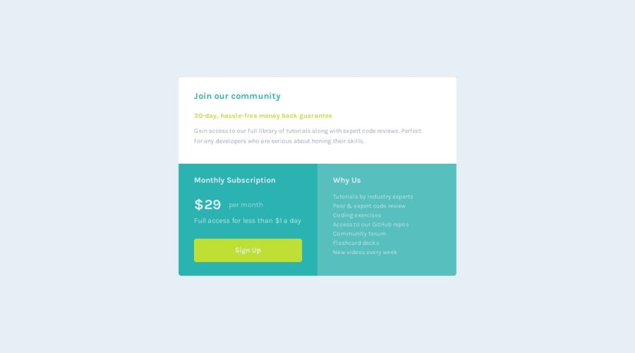
This is my 3rd challenge. I had fun doing it, I think its pretty close to the original, but not perfect. It took me some time to get it right, but I think I have learned a bunch too.
One of the most useful things I took away from this is just how much using developer tools simplifies your life. They make it much easier to move things around once you have the text and text sizes down. Using adjusting margins, paddings and other things using dev tools in your browser allows you to easily make adjustments and shift things around to make it look close to the intended design.
Appreciate any feedback and good luck with your own projects.
Community feedback
Please log in to post a comment
Log in with GitHubJoin our Discord community
Join thousands of Frontend Mentor community members taking the challenges, sharing resources, helping each other, and chatting about all things front-end!
Join our Discord
