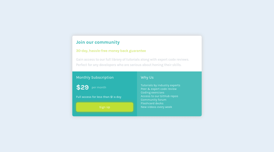
Design comparison
Solution retrospective
Any feedback?
Community feedback
- @AdrianoEscarabotePosted about 2 years ago
Hi Nada Elhosary, how are you?
I really liked the result of your project, but I have some tips that I think you will enjoy:
- every Html document must contain the main tag, so we can identify the main content, to fix this, wrap all the content with the main tag. HTML5 landmark elements are used to improve navigation experience on your site for users of assistive technology.
- Consider using rem for font size .If your web content font sizes are set in absolute units, such as pixels, the user will not be able to re-size the text or control the font size based on their needs. Relative units “stretch” according to the screen size and/or user’s preferred font size, and work on a large range of devices.
The rest is great!
I hope it helps... 👍
Marked as helpful0 - @VCaramesPosted about 2 years ago
Hey there! 👋 Here are some suggestions to help improve your code:
-To better specify the main content of you site you will want to encase your entire component inside a Main Element.
-
None of the individual components are Article Elements since they do not make sense on their own and are not reusable. Instead, you can wrap the entire component in it.
-
The button was created with the incorrect element. When users click on the button they should directed to a different part of your site; that Anchor Element will allow this to happen.
If you have any questions or need further clarification, let me know.
Happy Coding! 👻🎃
0 -
Please log in to post a comment
Log in with GitHubJoin our Discord community
Join thousands of Frontend Mentor community members taking the challenges, sharing resources, helping each other, and chatting about all things front-end!
Join our Discord
