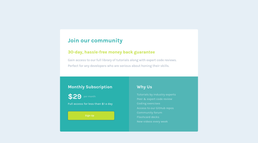
Single price compenent using HTML & CSS (Flex, Grid)
Design comparison
Solution retrospective
La verdad tuve algunas complicaciones a la hora de alinear algunos textos, pero pude resolverlos. Recibo feedbacks, opiniones o consejos para mejorar el codigo. Muchas gracias por leer!
Community feedback
- @AdrianoEscarabotePosted almost 2 years ago
Hello valentin vera, how are you? I truly loved your project's outcome, however I have some advice that I hope you'll find useful:
You have used <br> , using <br> is not only bad practice, it is problematic for people who navigate with the aid of screen reading technology. Screen readers may announce the presence of the element. This can be a confusing and frustrating experience for the person using the screen reader. You can read more in MDN.
I noticed that the card is growing a lot at higher resolutions, this is happening due to the relative measurement unit, to solve this we can do this:
@media (min-width: 768px)
.main {
    max-width: 840px;
    margin: 0 auto;
}
The remainder is excellent.
I hope it's useful. 👍
0
Please log in to post a comment
Log in with GitHubJoin our Discord community
Join thousands of Frontend Mentor community members taking the challenges, sharing resources, helping each other, and chatting about all things front-end!
Join our Discord
