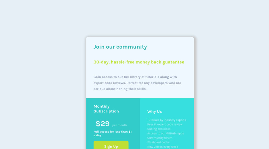
Design comparison
Solution retrospective
Hey everyone, CSS has always been a challenge for me, but I am going to conquer it someday ! ( Feedbacks are more than welcome ) Happy coding and cheers.
Community feedback
- @mattstuddertPosted almost 4 years ago
Hey Sibasish, great to see you working on your CSS skills. The more you practice the better you'll get! Nice work on this challenge. Here are some pointers after taking a look at your code:
- Avoid using inline styles in your HTML. Instead, put all of your styles in your CSS file and target the elements you'd like to style.
- Always be sure to have one
h1
heading. For this design, I'd say it would be the "Join our community" heading. - If a piece of content isn't a heading for another piece of content, don't use a heading element. The "30-day, hassle free..." and "Gain access to our..." blocks aren't headings, so I'd recommend using paragraph tags. Likewise for "$29 per month" and "Full access for less than...".
- You don't need to use
position: absolute;
to position the card. You could use Flexbox or Grid to centre it instead. Avoid usingposition: absolute;
except for very specific circumstances when you have a clear reason. It's a declaration that can easily cause problems with your styles. - You've done well with the overall layout of the component. I'd recommend having a go at refining your styles to try getting your project to match up closer to the design. Training your eye for detail is definitely worth the time investment!
I hope this helps. Keep up the great work!
1@SibasishSinhaPosted almost 4 years ago@mattstuddert Hi, Thanks a lot for pointing these out. I will definitely work on these above mentioned points. There's one thing that I would like to say, that is, whenever I render the page on my device, it seems to work fine ( the design and the responsiveness, since I check it using dev tools before posting it ), but, whenever the my design gets rendered here, it arises a problem. Why is that ? Can you please explain ? Once again, thanks a lot for guiding me with these helpful pointers !
0@mattstuddertPosted almost 4 years ago@SibasishSinha you're welcome! That's interesting. For me (I'm using Chrome), it renders as it does in the screenshot. The one difference is that we clip the screenshot for this challenge. So because your solution is a bit taller than the design, the bottom gets cut off a bit.
0@SibasishSinhaPosted almost 4 years ago@mattstuddert Even i use chrome, but it renders perfect for me ( 1920 X 1080 ).
0@mattstuddertPosted almost 4 years ago@SibasishSinha ah OK, perhaps it's because you're at a higher resolution. I'm using a MacBook with a 1440x900 screen. The design is at 1440px width as well. So perhaps that's what's causing the visual difference for you. Try looking at it using the device emulator or by resizing your browser. That should show you how it looks at the same size as the design.
0@SibasishSinhaPosted almost 4 years ago@mattstuddert Then I guess, it would be better if I add media queries for 1440px and for a standard mobile view
0@mattstuddertPosted almost 4 years ago@SibasishSinha I'd recommend letting the content dictate the layout based on the device size. What I mean by that is you don't necessarily need to add breakpoints at very specific sizes. Instead, test your project out on a range of screen sizes and add breakpoints whenever you need. This will create a truly responsive website.
1
Please log in to post a comment
Log in with GitHubJoin our Discord community
Join thousands of Frontend Mentor community members taking the challenges, sharing resources, helping each other, and chatting about all things front-end!
Join our Discord