Submitted 4 months ago
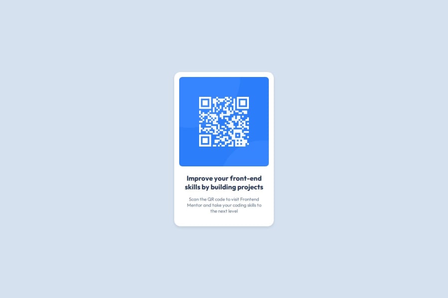
Single-page website with a QR code using HTML and CSS
@DmitryIsTrying
Design comparison
SolutionDesign
Solution retrospective
What are you most proud of, and what would you do differently next time?
To be honest, I’m not a complete beginner, but I recently started using Frontend Mentor.
The work was easy; I mainly wanted to try deploying my first project. In the future, I will take on more challenging projects and try to implement them.
What challenges did you encounter, and how did you overcome them?I didn't encounter any difficulties, but I imported a Figma file for the first time; before that, I received links to templates.
What specific areas of your project would you like help with?If you’d like, you can take a look at the CSS file. Maybe I hardcoded something not very well. But please, don’t nitpick about the fact that I didn’t write classes for the divs.
Community feedback
Please log in to post a comment
Log in with GitHubJoin our Discord community
Join thousands of Frontend Mentor community members taking the challenges, sharing resources, helping each other, and chatting about all things front-end!
Join our Discord
