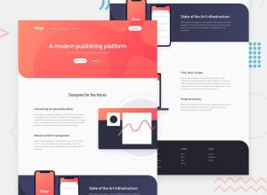
Design comparison
SolutionDesign
Community feedback
- @denieldenPosted over 2 years ago
Hi Gowsala, great work on this challenge! 😉
Here are a few tips for improve your code:
- use
headertag to wrap the navbar for improve the Accessibility and not also the slider/first section - add
maintag and wrap allsectiontags for improve the Accessibility - add descriptive text in the
altattribute of the images - instead of using
afor the buttons usebuttontag - to make it look as close to the design as possible create a
sectionfor the slider/first section and addheight: 60vhproperty andflexfor center the element inside it - in the mobile nav add
border-radius: 1remtomenuclass - instead of using
pxuse relative units of measurement likerem-> read here
Overall you did well 😁 Hope this help!
0 - use
Please log in to post a comment
Log in with GitHubJoin our Discord community
Join thousands of Frontend Mentor community members taking the challenges, sharing resources, helping each other, and chatting about all things front-end!
Join our Discord
