


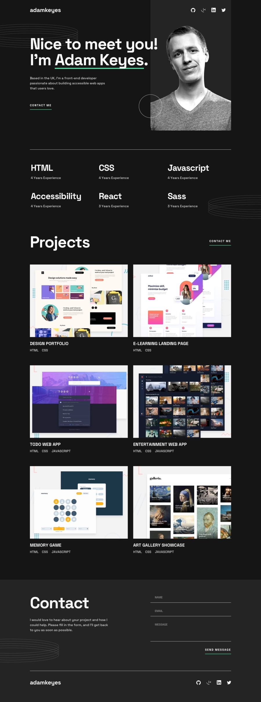
Design comparison
Solution retrospective
Issues I can't figure out for the life of me:
- how to change the svg icons color;
- how to change the size of the hero image dynamically based on screen size;
- how to position absolutely the circle/rings pattern without messing up the size of their container.
If anyone can help me with this, I'd be forever in your debt. You can also send me an email by using the Contact section on the project :)
Community feedback
- @cuftamasterPosted over 1 year ago
-use inline svg, if u look at a svg in a text editor, like visual studio code, u will see that it is a vector graphic writen with vector graphic rules, paste that in your html, and than u can target its properties in css
a svg:hover path { fill: #556B2F; }-tutorial on the topic link
-overflow hidden, basically
but u have some problems with layouts in general, below 1560px the your grid system breaks down, u can fix that by playing around with fr-s, gap-s, centering the content of the grid ect.. i know grid is powerful and can do a lot of complicated stuff, but overall you could have used flex for the whole thing as it is much easier and quicker to work with
put some transitions on links
the profile img should be able to "stack", meaning it should be either positioned absolutely, or a flex item
i hope this helps u at least a little bit. best regards!
Marked as helpful0 - @meantoesPosted over 1 year ago
hi! congrats on finishing this project!
tbh, I have no idea how u write the code but if I can see the HTML file, I think u need more dividers for each section so u can set them with different sizes and displays.
here's how I'd do it:
- div for the hero:
.hero { display: grid; grid-template-column: 2fr 1fr }- div for skills:
.skills { display: flex; flex-wrap: wrap; } /* add class skill for each item */ .skill { width: calc(100% / 2 - 20px); /* adjust for each screen sizes */ }- div for projects' grid:
.project-grid { display: grid; grid-template-column: 1fr 1fr; /* adjust for each screen sizes */ }- div for contact and input (create two different grids for each):
.contact {
display: flex;
flex-direction: row; /* adjust for each screen sizes */
justify-content: space-between;
}
dont forget to add margin for each divs. or in the main-container if u put them in a container.
hope this helps🙌🏻 have a great day⭐
0


Please log in to post a comment
Log in with GitHub
Join our Discord community
Join thousands of Frontend Mentor community members taking the challenges, sharing resources, helping each other, and chatting about all things front-end!
Join our Discord