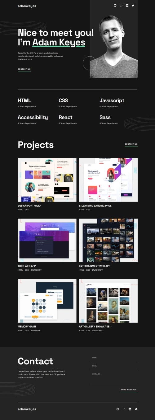
Single Page developer portfolio with React

Solution retrospective
I am most proud of making the website as responsive as possible. The website will look good on any device. I also used framer-motion to add a bit of animation to the project images. When you hover over the images, it will animate a dark overlay over the image and fade-in two buttons. What I would do differently next time is use GSAP to add scrolling animation to the website, it has been a while since I've used that library
What challenges did you encounter, and how did you overcome them?The biggest challenge was making sure the website was fully responsive on all devices. I overcame this challenge by using my own knowledge of CSS and @media queries. I may have used more @media queries than I should have, but the end result was worth it
What specific areas of your project would you like help with?I don't think I needed any help with this project, but I'm always open for advice and constructive criticism.
Please log in to post a comment
Log in with GitHubCommunity feedback
No feedback yet. Be the first to give feedback on Abel Muro's solution.
Join our Discord community
Join thousands of Frontend Mentor community members taking the challenges, sharing resources, helping each other, and chatting about all things front-end!
Join our Discord