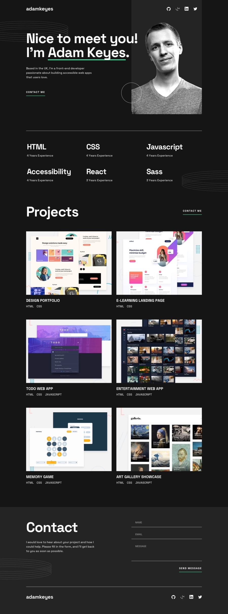
Design comparison
Community feedback
- @numenorNumenorPosted about 2 months ago
Hi There ! very good work, really nailed it.
I found that the hover effect on project items works only on desktop width sized screens.
What technologies did you use? I checked your source code and it looks different, to be price: the tags, they are all over the place :D what is that?
thanks! keep up the good work.
0@wonderlust101Posted about 2 months ago@numenorNumenor
The hover effect is only desktop. In mobile, you can't hover things unless you have a mouse connected to a phone/tablet but that's an edge case scenario. When at smaller viewports, the buttons are moved under the title and technologies used in the project. It's also part of the design that was given to me.
The technologies I used are react, scss, typescript and bundled with vite. The naming methodology for my scss/css is BEM and I mostly stuck to the airbnb style guide.
When your talking about the tags, I assume your talking about props which is a react thing.
1
Please log in to post a comment
Log in with GitHubJoin our Discord community
Join thousands of Frontend Mentor community members taking the challenges, sharing resources, helping each other, and chatting about all things front-end!
Join our Discord
