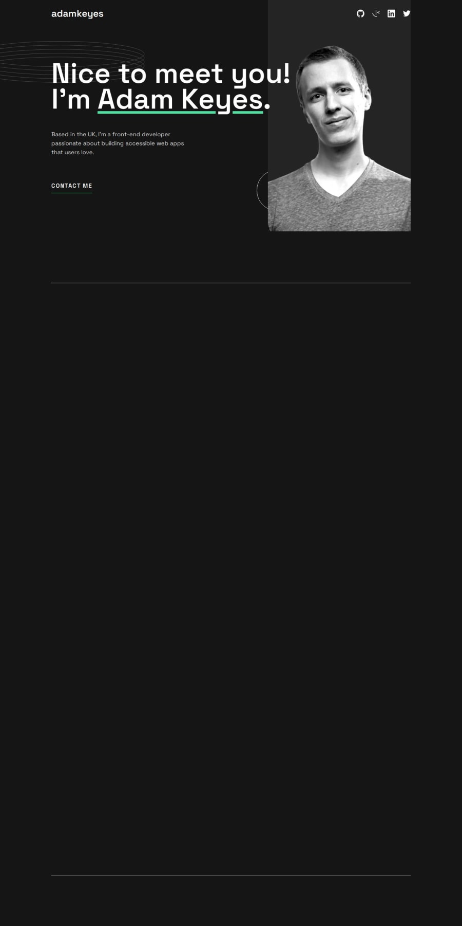
Single Page Dev Portfolio | React ⚛️ + Tailwind 🎨 + Framer-Motion 🎞️


Design comparison
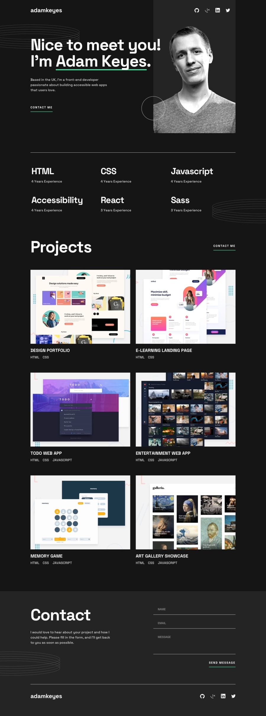
Solution retrospective
I'm most proud of the way I implemented the following:
- Section animations
- Reusable UI in components
- Hover states for buttons + links
Here are a few things I'd do differently:
- Create class styles for text and sections: For more consistent styles. (h2 tags, section margins, etc)
- Create class styles for transitions (transition, duration, ease in)
- Note UI that can be componentized before coding
- Work on small decorative images + hover effects last: These make the project look polished, but of lowest priority
I struggled a lot with background image positioning. The images often wouldn't scale right when changing the viewport width.
My workaround was to set background-positions for different media queries. How else could I have solved this?
What specific areas of your project would you like help with?My Questions:
When dealing with small decorative background images, how do you responsively position them fluidly?
Is there a way to do this without assigning abrupt background-positions for each media query?
Thank you for taking the time to review my solution. Any feedback helps!
Community feedback
Please log in to post a comment
Log in with GitHubJoin our Discord community
Join thousands of Frontend Mentor community members taking the challenges, sharing resources, helping each other, and chatting about all things front-end!
Join our Discord