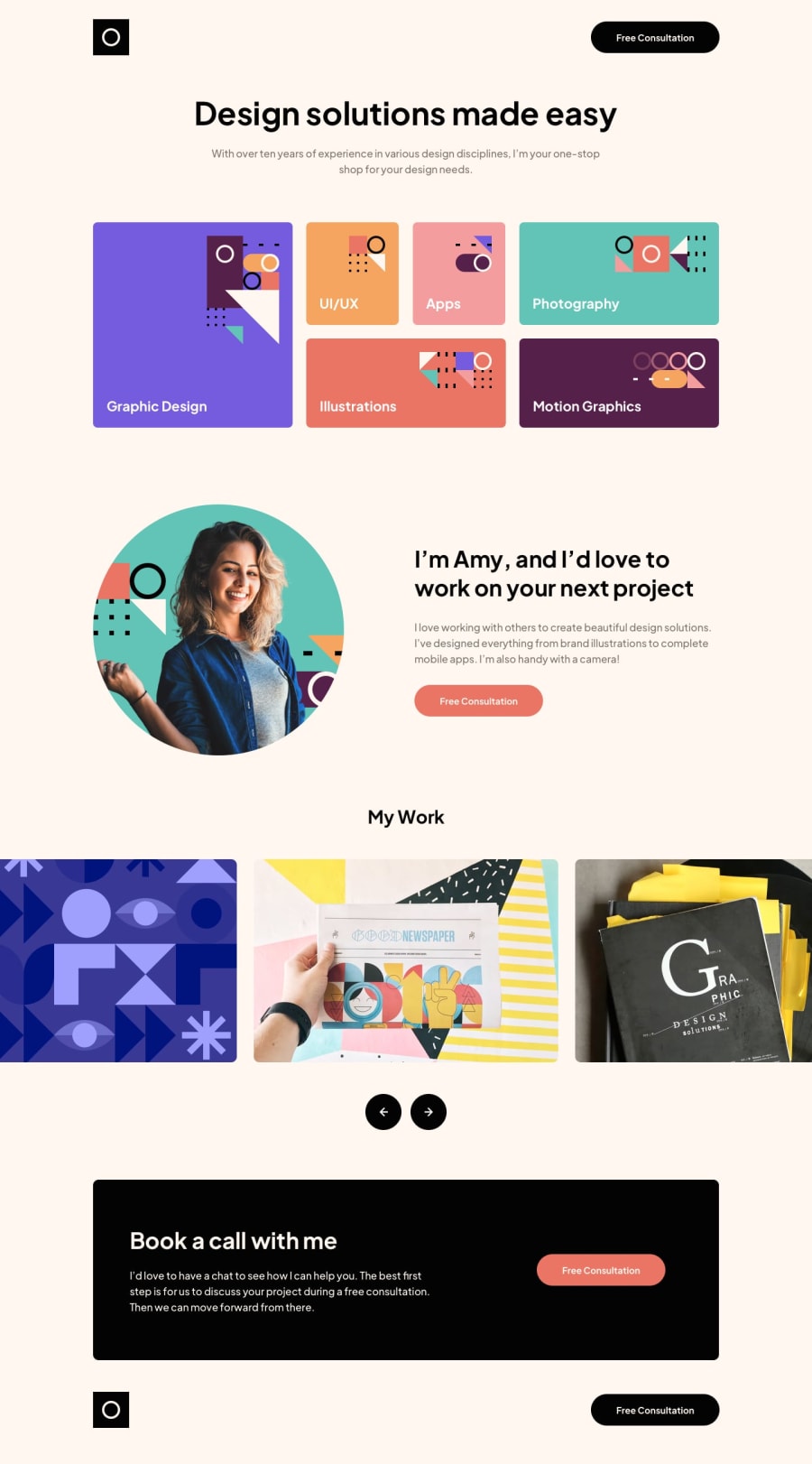
Design comparison
SolutionDesign
Solution retrospective
What are you most proud of, and what would you do differently next time?
Next time I will try to focus on better convention naming and also maybe limit of using @media queries. I'm proud of grid and small animations.
What challenges did you encounter, and how did you overcome them?Grid proved to be quite tricky at the very beginning, especially grid areas, but later on I really appreciated it and its fluidity when using media queries
What specific areas of your project would you like help with?- naming, not really god enough
- limit media queries and maybe more fluid layout with em's
Community feedback
Please log in to post a comment
Log in with GitHubJoin our Discord community
Join thousands of Frontend Mentor community members taking the challenges, sharing resources, helping each other, and chatting about all things front-end!
Join our Discord
