


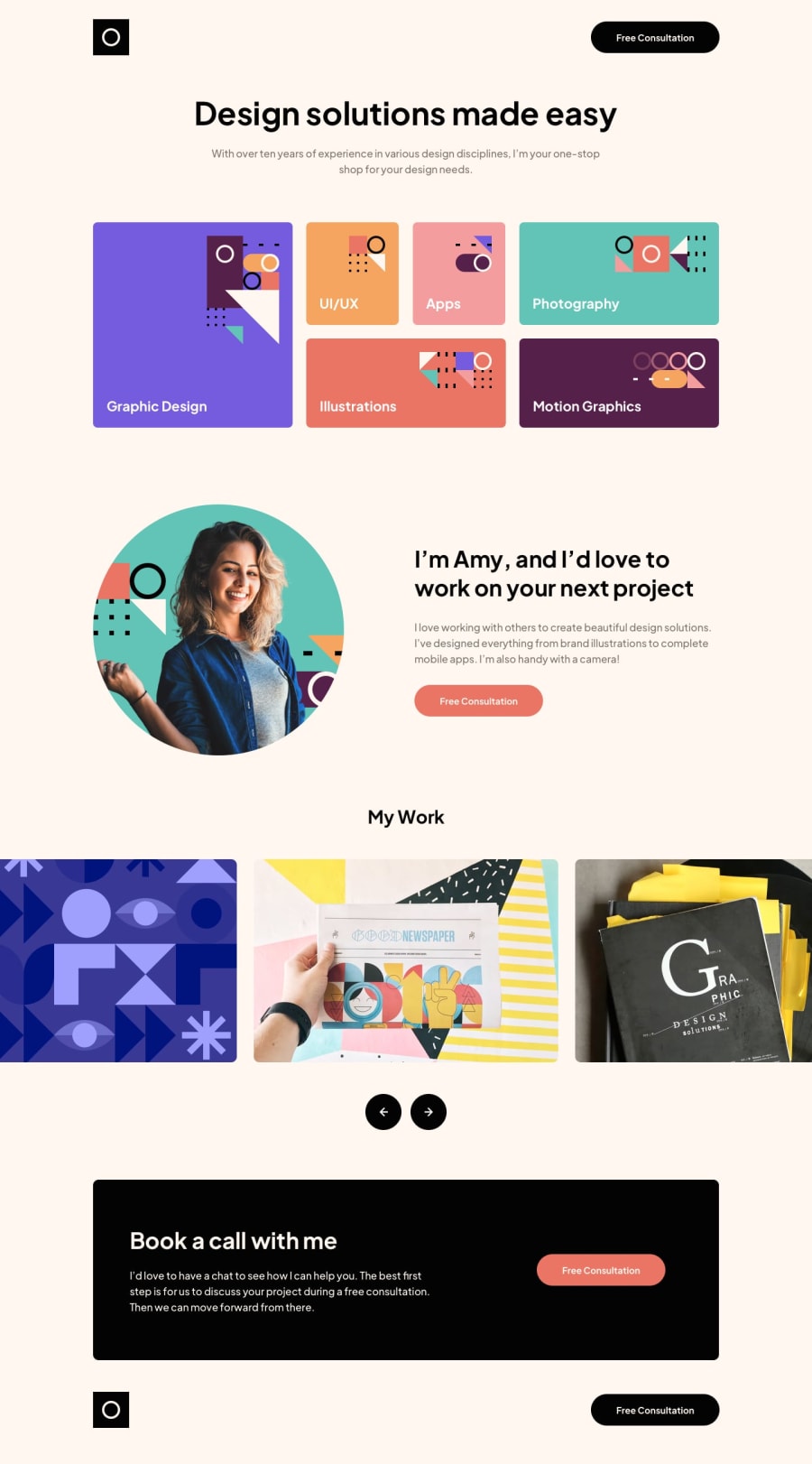
Design comparison
Solution retrospective
Guys! The carousel is not the same as in design, but it serves the purpose. If you are so kind to help me how to do something similar to the one in the exercise, I will gladly listen to you or read you!
🥳 Happy Codding!
Community feedback
- Account deleted
There is quite a lot wrong with this. The entire design is shifted toward the left instead of being centered in the page. None of the hover states work, you have them as active states instead. Your design is also not responsive at all. The design stays the same as it is on Desktop as on Mobile. The slider also only shows 1 image at a time instead of 3. Lastly you should avoid using ID names such as "Foo" in your code, if you make a big project, it may be difficult to understand what each ID is for if you use such vague terms.
My suggestions are to redo the project and approach it like this. Start by designing the mobile design first. This is the easiest because everything just stacks on top of each other. No need for CSS grid here, just very basic flexbox. Then when you have fully fleshed out the mobile design, expand the screen a bit, add in a media query and start adding in the CSS grid properties. You will find this to be much easier making it responsive this way.
Good use of semantic markup though!
1@aavv8931Posted about 2 years ago@ashmaddenweb I really appreciate your comments. I will try to fix them. But, I have a few questions and comments:
-
What do you mean with "its not responsive"? Because I use "inspect mode" in chrome I changed sizes and it response according to the media query.
-
About the slider...I know it only show 1. I tried doing exactly the example. If you could provide a source where I can learn. I'd appreciate.
Thank you. Your comments are very welcome! ✌🏻👨🏻💻
0Account deleted@aavv8931
Open up Chrome and view the website, try change the size of the Chrome browser and you will see what I mean, it is not truly responsive, the content overflows. The reason this happens is because you have set specific widths for certain sections like Main. You should avoid doing this because the content should just adjust automatically. You can use max-width instead if you don't want a section to get too big.
Secondly you can use a library like https://swiperjs.com/ for the slider.
If you found this comment helpful please choose that setting so that I can get additional points, thanks.
Marked as helpful0 -
Please log in to post a comment
Log in with GitHub
Join our Discord community
Join thousands of Frontend Mentor community members taking the challenges, sharing resources, helping each other, and chatting about all things front-end!
Join our Discord