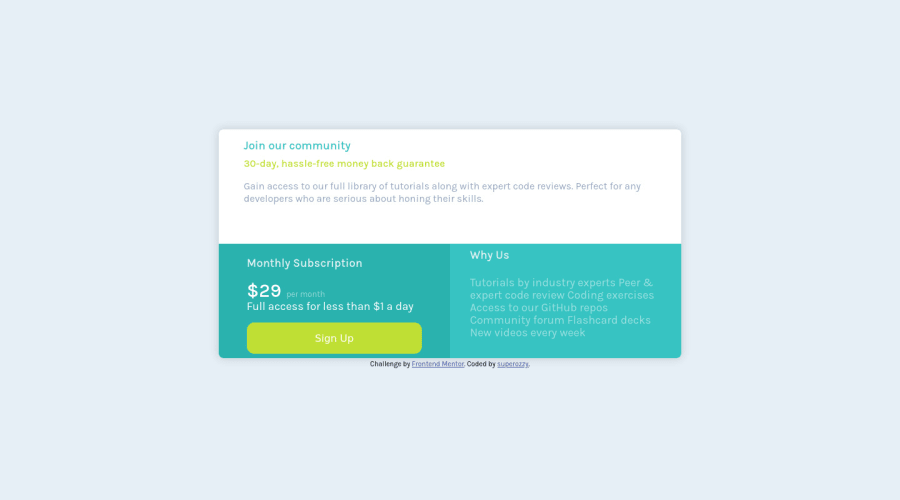
Design comparison
Solution retrospective
any feedback is welcome
Community feedback
- @ApplePieGiraffePosted over 4 years ago
Hi, there again, superozzy! 👋
Good job on this challenge! 👍 Your solution is responsive! 🙌
I suggest,
- Adding a hover state to the button in the card component.
- Adding a little more space around the content inside the card component (as in the original design) to give the text some more room.
- According to your solution report, looks like you don't need that
inputattribute on the button! 😉
Keep coding (and happy coding, too)! 😁
1@superozzyPosted over 4 years ago@ApplePieGiraffe thank you very much for your reply! yes its seems that i have some issues with my report, thank you for your time!
0 - @grace-snowPosted over 4 years ago
Hi @superozzy
Well done on this. I have a few suggestions for you in addition to those above.
Looking at your html, you are nesting a lot of divs and there's no reason for this really. Remember you can put multiple classes on an element if needed, and not everything has to be wrapped in a div.
Similarly, some of your headings are only in divs. That's not valid html - text needs to be in a text element, and these really should be headings (h2s) to give context and meaning to your component.
At the moment, I can't tell whether you're doing this in flex or grid. You seem to have both in the stylesheets but Im not sure why? This is ideal as a css grid challenge... I saw your note about wanting to try flex, so now not sure why the grid stuff is there too.
One best practice tip - it's best to have all your css in one stylesheet not 2. All that does is force more trips to the server and therefore slow performance
Overall, this will be much easier to follow if you
- simplify the markup
- use consistent code nesting in html and css
- keep all styles together
- use only single class selectors in css
- remove anything unnecessary or repeated in css
I hope that's all helpful advice. Keep on learning and progressing
0@superozzyPosted over 4 years ago@grace-snow thanks for your reply, yeah i will try less divs the next time,it was somehow chaotic at some point, but it help me.i didnt know for the styles,so next time it will be together,i thought it would be more cleaner code that way. thanks again it was very helpful,and always i try to use your tips. cheers 🍻
1 - @superozzyPosted over 4 years ago
@WarBaddy hi ,thanks for the advices,i think i fixed the most of it!! but i delete the previous one because it didnt let me to uplad the new. anyway thanks again ,also any feedback for the new will be welcome
0
Please log in to post a comment
Log in with GitHubJoin our Discord community
Join thousands of Frontend Mentor community members taking the challenges, sharing resources, helping each other, and chatting about all things front-end!
Join our Discord
