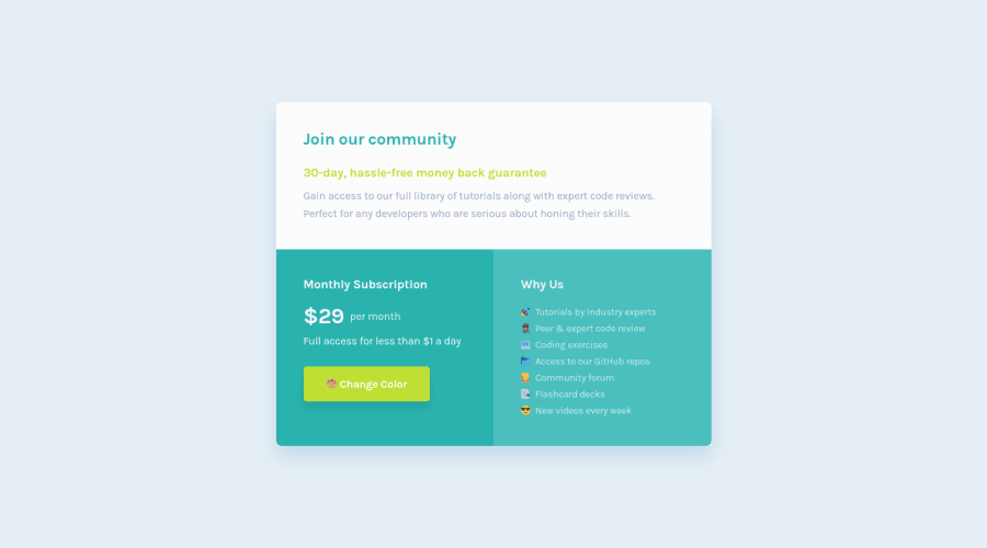
Single Grid Component (Vanilla CSS + Easter Egg)
Design comparison
Solution retrospective
👾 Hello, coding community!
😎 This is my solution to the Single Price Grid Component. I had a lots of fun doing the challenge.
🎨 I added some personal design improvements and also the button to change the card component color.
I'll be happy to hear any feedback and advice!
Community feedback
- @AdrianoEscarabotePosted about 2 years ago
Salve lucas! Cara ficou ótimo ahahhahaha
Observei que você fez duas paginas para mudar os textos e emojis! Para simplificar mais poderiamos fazer com js, existem algumas formas de fazer isso, mas usaremos uma função no botão de mudar tema!
Primeiro adicionemos a propriedade on click, chamando a função cada vez que o usuário clicar nele.
<a class="btn-2" onclick="change()">👽 Change Color</a>
Agora criaremos a nossa funçaõ no js, mas primeiros adicionaremos alguns ids nos elementos que queremos manipular via js.
<li> <span id="emoji">👽</span> <span id="text">Tutorials by industry experts</span></li>
Com esses elementos conseguimos já conseguimos ter uma noção do que está acontecendo!
Para fazer a mudança dos textos e emojis usaremos a propriedade
innerHTML
que basicamente funciona assim:text.innerHTML = "ira mudar o conteudo que aparece no html, para o conteudo que estiver aqui dentro"
vai ficar assim:
let text = document.getElementById("text") let emoji = document.getElementById("emoji") function change() { document.body.classList.toggle("light-theme") if (document.body.classList.contains("light-theme")) { emoji.innerHTML = "😔" text.innerHTML = "Oi né" } else { text.innerHTML = "Testeeeeee" emoji.innerHTML = "😁" } }
adicionei isso no css:
.light-theme { --cyan-1: rgb(16, 22, 22); --cyan-2: rgb(82, 77, 9); --cyan-3: rgb(187, 77, 44); }
espero que ajude man 👍
Marked as helpful1@correlucasPosted about 2 years ago@AdrianoEscarabote Valeu! Depois dessa aula deu até vontade de aprender JS.
1 - @GrzywNPosted over 2 years ago
Great one 😆
Everything is well coded and looks great. What I can suggest to you for your future projects is to try making changes of website without refreshing the page. Probably the best way is to use JavaScript and change every text content or image source of targeted image, but I don't know how is your coding in JavaScript. It can also be done using
:target
CSS selector (I think I used it in my QR Code solution). You could also manipulate text using some pseudoclasses andcontent
property.I recommend learning some type of naming convention (BEM, Cube CSS). Personally I prefer BEM. It would help you in making your projects scale better. Using generic tags like
h1
orul
might become hard in your future projects. And it's easy to pick up and start using it.Once again great job! Have a nice day and happy coding 😎
Marked as helpful1@correlucasPosted over 2 years ago@GrzywN Thank you! I'm started to study Html and Css from few months, before start to learn Javascript I want to finish all html and css challenges, to make sure I'll be good enough replicating many html and css pages.
I did some projects using BEM, its useful, but for small challenges like this one I didn't use it. Anyway I think BEM is really ugly, cuz the classes become really long like, "container__card--photo--active", but I'm sure that in the future I'll have to use it to organize and scale. Indeed I searched other css naming convention, but BEM is widely used!
Thanks for the feedback!
1@GrzywNPosted over 2 years ago@correlucas No problem. Actually
container__card--photo--active
isn't a valid BEM class. It would be better to make a reusable card component for examplecard
and then photo in itcard__photo
. And if you don't know how to name an element you can also use single dash for example:<footer class="footer"> <img class="footer__logo" src="" alt="" /> <div class="footer__socials"> <ul class="footer__socials-list"> <li class="footer__socials-item">...</li> ... </ul> </div> </footer>
and so on. Or valid BEM example based on your class name:
<main class="container"> <div class="grid"> <div class="card card--dark"> <img class="card__image" src="" alt="" /> <p class="card__paragraph">Lorem</p> </div> <div class="card card--dark card--rotated"> <img class="card__image" src="" alt="" /> <p class="card__paragraph">Ipsum</p> </div> ... </div> </main>
Naming can differ, but it should always be one block, one element and at most one modifier in a class name. You can use 2 modifier classes for the same element, but with other modifiers. Class without modifiers must be present as a base block/element.
You can also check other approaches like Tailwind CSS, but it might be hard to use in plain HTML without any framework.
Good luck on your future projects ✌️
Marked as helpful1 - @teoh4770Posted over 1 year ago
Hi Lucas,
This is awesome ⭐⭐⭐
I had done this challenge a few months before and struggled greatly during the progress. Instead of making more projects, I felt I should improve the foundation of HTML and CSS by looking at some good examples in Frontend Mentor. Luckily, I came across yours and learnt a lot from it.
Just wondering, how do you practice your HTML and CSS and become so good at it? And do you need to fully commit to HTML and CSS first before learning about JS?
Best, CK from Canada
0
Please log in to post a comment
Log in with GitHubJoin our Discord community
Join thousands of Frontend Mentor community members taking the challenges, sharing resources, helping each other, and chatting about all things front-end!
Join our Discord