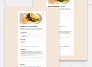
Design comparison
Solution retrospective
Helped me see the tiniest detail and work on it.
What challenges did you encounter, and how did you overcome them?color of list marker, padding contents, finding colors same as the design given because all colors were not given. learned about list marker, hit n trial for padding contents and finding colors.
What specific areas of your project would you like help with?i might not have completely made it exact. help me see it if theres any.
Community feedback
- @pritxxhPosted 12 months ago
Pros:
Utilizes semantic HTML elements effectively for content structure, including headings, lists, and paragraphs. Seamlessly integrates the image into the layout, enhancing visual appeal. Clean and visually pleasing design with proper spacing and typography choices. Follows a logical flow, neatly organizing recipe sections like ingredients, instructions, and preparation time. Areas for Improvement:
Accessibility could be enhanced with considerations for proper heading hierarchy, image alternative text, and keyboard navigation support. Responsive design needs attention to ensure optimal viewing across various screen sizes and devices. Consider adding interactivity for a more engaging user experience, like toggling section visibility or highlighting active steps. Code organization could be refined for better maintainability and scalability, possibly by modularizing styles or using CSS preprocessors. Performance optimization opportunities exist, such as CSS minification and asset delivery optimization, depending on project requirements. Overall, a solid foundation for a recipe page, with potential for improvement in accessibility, responsiveness, interactivity, code organization, and performance optimization.
Marked as helpful0
Please log in to post a comment
Log in with GitHubJoin our Discord community
Join thousands of Frontend Mentor community members taking the challenges, sharing resources, helping each other, and chatting about all things front-end!
Join our Discord
