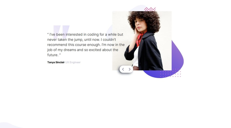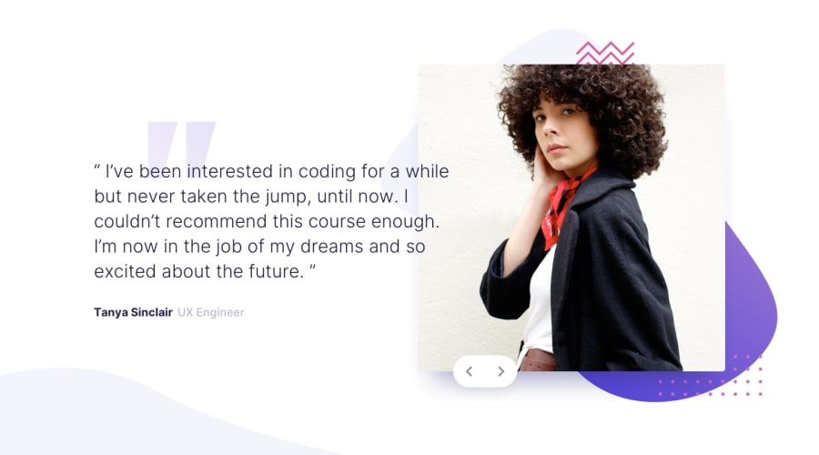
Design comparison
Solution retrospective
The project was not very tough for the design perspective but the slider-buttons took the most of my time to adjustment. They use to remain stable for Desktop screen sizes but could not be controlled for smaller screen less than 760px. Anyhow I have to use a lot of media queries for this purpose. I did not enjoy this part of my code! I would like to read on this to know how it can be better solved in pure-css or in any other css-framework. Moreover I enjoyed the Js part of the project.
What challenges did you encounter, and how did you overcome them?The slider-buttons took the most of my time to adjustment. They use to remain stable for Desktop screen sizes but could not be controlled for smaller screen less than 760px. Anyhow I have to use a lot of media queries for this purpose. I did not enjoy this part of my code!
What specific areas of your project would you like help with?The slider-buttons adjustment for small screen sizes
Community feedback
Please log in to post a comment
Log in with GitHubJoin our Discord community
Join thousands of Frontend Mentor community members taking the challenges, sharing resources, helping each other, and chatting about all things front-end!
Join our Discord
